Author Pat Kirkham discusses the opening titles for The Big Country, designed by Saul Bass, from her authoritative book Saul Bass: A Life in Film and Design.
Saul created a title sequence, a symbol and a comprehensive advertising campaign for this drama about a cultured Easterner (Gregory Peck) trying to make peace between two Western families fighting over water rights.
Saul recalled:
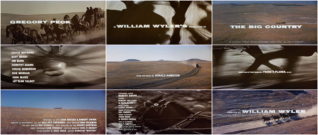
“This was a film about an isolated community in the West, a primitive place where the long arm of the law had not yet reached, and where feud-like animosities bubbled. Into this community came a cultural misfit from the East. What I tried to do in the title sequence was to dramatize, in tightly compressed montage, the three-month journey that Peck's character has made before the story starts.
To express the distance from the East, to convey the vastness of empty spaces, and thus dramatize the isolation of the Western town, I used a series of shots showing a stagecoach as a tiny object on the horizon, cross-cutting to intense ultra close-ups of the stagecoach on the move.., the horses' hooves flashing, hitting the ground, the blurred wheel spokes and hubs as they revolved furiously, the horses' manes whipping through the air, their heads and eyes flashing through the frame.
Then we cut back to the stagecoach. It's so small that it takes an unfolding puff of dust to tell you that it's there. It barely seems to move. Cut to more close-up furious activity, and it moves an eighth of an inch on the horizon. The time sense is amplified by extremely long cross-dissolves so that for discernible periods of time the image we lose and the image we gain are superimposed on the screen simultaneously. The juxtaposition of the furious close-up activity and minimal movement of the coach in the long shot dramatizes the amount of energy it took to cover the vast distances. So that finally when the stagecoach gets to the settlement, you know you are in... The Big Country.”
Title Designer Wayne Fitzgerald noted, “It took five minutes to get across the screen. Then he put a tiny little title on there, so, by God, that country was big. Bass showed that if you put a small title in an area where you can read it, it's more readable than a big title.”
Pat Kirkham is Professor in the History of Design, Decorative Arts and Culture at the Bard Graduate Center for Studies in the Decorative Arts, Design & Culture, New York. She has written and edited a number of books, including Charles and Ray Eames (1998) and Women Designers in the USA 1900–2000 (2001).
©2011 Laurence King Publishing Ltd. Used with permission.
Titles Designed by: Saul Bass
Director of Photography: Franz F. Planer
Music by: Jerome Moross
Discover more Saul Bass
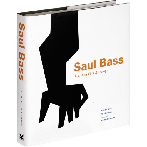
SAUL BASS: A LIFE IN FILM AND DESIGN
By Jennifer Bass and Pat Kirkham


