If a film is lost, can it be remade?
The answer to that question is waiting to be unearthed in The Forbidden Room, a feverish experimental feature from Canadian auteur Guy Maddin and longtime collaborator Evan Johnson. At once a gleeful throwback to the silent movie era and an incomprehensible love letter to the “lost movie,” the film’s narrative cannot be easily parsed. It suffices to say that the proceedings involve submarines and amnesia, lumberjacks and lobotomies, bathing tutorials and women skeletons, and like much of Maddin’s absurdist work it invariably leaves most people scratching their heads.
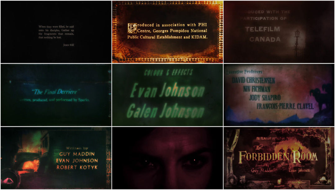
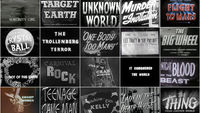
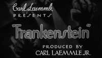
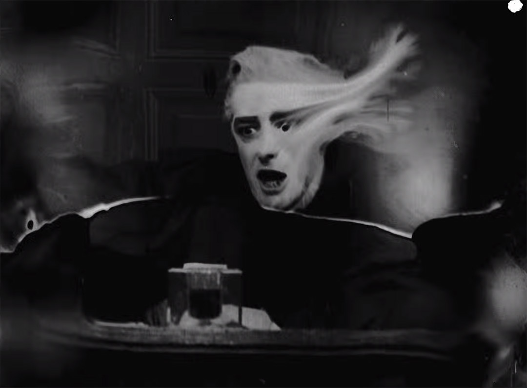
The opening moments of The Forbidden Room are a muddy and melted statement of intent, assailing the viewer with a barrage of old-timey title cards, all badly degraded either physically or digitally, many changing style and typeface mid-credit. Full of half-heard musical overtures and opening notes, this clamourous introduction sets the stage for a chain of seemingly unrelated vignettes based upon silent films both real and imagined. The whole experience feels as though someone exhumed a box of tattered film reels from a partially submerged basement, hastily spliced them together, and projected the strange results out into the world for all to see.
In reality, though, the opening of The Forbidden Room was a far more deliberate affair. Mostly. Maddin charged production designer Galen Johnson with the behemoth task of creating the hundreds and hundreds of intertitles needed for the film (and eventually its opening and closing title sequences), each one specially designed to reflect the story it was a part of and the information being communicated. The final product is a remarkable pastiche of early title design that would be almost indistinguishable from the real thing if not for Maddin’s distinctive sensibilities.
A discussion with Production Designer and Title Designer GALEN JOHNSON
Give us a little background on yourself and your work. You went to school for architecture but then moved into graphic design, right?
I went into architecture school right out of high school. I thought it would be a good compromise between what I liked doing – art – and what I could realistically get a job doing. But to be an architect you need more than just an undergraduate degree – you need to get a masters, to pass registration exams. By the time I graduated I think I just had school exhaustion, and architecture exhaustion. I started working as a graphic designer and illustrator, which is what I did for seven or eight years, in various capacities, until I started working with Guy.
So you and your brother Evan, who co-directed Forbidden Room, have worked with director Guy Maddin several times now. What was your introduction to Maddin and his work?
I think I first read about Careful in one of those Leonard Maltin film guides. The ones that have little capsule reviews. Its two sentence synopsis really intrigued me – it sounded really cool and weird. I thought the date – 1992 – and the country – Canada – must have been typos. Not only were they not typos, but the director lived in Winnipeg, a few blocks from me!
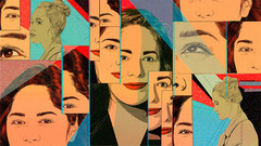
The "living poster" for The Forbidden Room
The first film of his I saw was Dracula: Pages from a Virgin's Diary, or maybe Heart of the World. Either way, it was pretty unique and exemplary work – and funny, which is maybe what intrigued me the most. How he could take such a personal and esoteric style and make it completely accessible and welcoming – to me, at least – with humour. My brother Evan was taking English & Film studies at the University of Manitoba and was a student of Guy's and eventually his TA. Evan and I were roommates back then and Guy and Evan and I would watch a lot of movies together, mostly curated by Guy or his colleague George Toles. So I'd seen most of his favourite films before I started working for him.
How did you first become involved with The Forbidden Room?
The Forbidden Room was initially Seances, an experimental short film website project. Guy had been toying with the idea of remaking lost films for years. Evan started helping him out with research, and eventually writing. I was working a 9 to 5 job as a graphic designer at an architecture firm and I think Guy felt sorry for me – he hates regular jobs – so once the project was greenlit he asked me to be his production designer. I didn't know what a production designer was but I looked it up on Wikipedia and it sounded fine.
How did The Forbidden Room spin off of Seances?
It's much easier to get a feature film funded than an experimental short film website – which is what Seances is – so we agreed to cobble together some of the Seances stuff into a feature film to raise more funding.
Maddin is known for using intertitles in his previous films, notably in My Winnipeg. How did his previous films impact The Forbidden Room?
I'd always loved his previous intertitles – which he'd shoot with a Super 8 camera and transparencies on a light box – I just wanted to expand on what he'd already done. More styles, more illustrations, more colours, more animation. More was sort of the M.O. of the whole project. And I had to do it digitally, for a number of reasons, so I couldn't use the same Super 8 method. I had to find ways of making completely digital titles feel loose and messy and organic.
The best intertitles made me feel a combination of shame as a designer and pride as an artist.
My Winnipeg (2007) opening sequence
So how many intertitles in total did you end up creating for the film?
I probably created 500 for The Forbidden Room, but because of trimming and edits there are only about 400 in the feature. And then I redid them all in French for the French version!
On the Seances website there will probably be 3000 or more. We're using intertitles [there] to completely change the narrative of the films. So by replacing the soundtrack and intertitles – but leaving everything else about the edit the same – a narrative about a Russian guard and Ukrainian prisoner duking it out in a prison camp can become a narrative about two Winnipeggers arguing over the price of patio chairs at a home and garden store.

Image Set: The Forbidden Room intertitle examples
Where did you find all the reference material?
I had seen loads of silent films by the time I started work on The Forbidden Room, and I spent hours combing through YouTube and the Prelinger archives, trying to find films with their original intertitles. Films in really bad condition, with lots of dirt and murkiness, weird cropping and missing frames and reels. Carl Dreyer's Vampyr – not the cleaned up Criterion version, but the murky, low quality version on YouTube – is a great example. Its picture and soundtrack are so degraded that sometimes they're barely even there. Jean Epstein's The Fall of the House of Usher was another favourite, particularly for the intertitles. A short Italian silent comedy called Pick e Puck had some pretty zany fonts and wonderful accidental edits. Bill Morrison's found footage films, particularly Decasia, were one of the biggest influences on the look of the film as a whole. Decasia is degraded and damaged in such a way that people start to look like ghosts and it feels like the film is melting as it goes through the projector.
I really wanted to cram as many tonal shifts into the sequence as possible, with each intertitle interrupting and undermining the mood of the previous one.

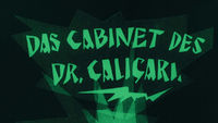
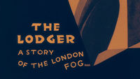
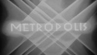
Image Set: Silent era inspirations
What took me by surprise is just how insane some of these lost films sounded. People think of Guy's films as really willfully obscure but some of these lost films sounded just as bizarre, if not more so.
Guy Maddin has a reputation for shooting things very quickly and roughly. Were you creating the intertitles in reaction to what was shot or were you basing them off a script?
We do work with scripts, but most of the intertitles are written by Guy once a rough cut is complete. It's then that you start to see what narrative stuff needs clarifying. It's then that the tone and character of the movie really start to emerge. All that stuff influences the tone of the intertitle writing. And then the writing influences the design of the intertitles.
When it came to all things design and typographic they would just let me do my thing. As for the treatment, texturing and colouring of the film itself, Evan and I worked that out together, and I'd apply many of the same treatments to the intertitles that we did to the footage.
Let’s talk about the opening and end title sequences. They just let you do your thing, but what was your original concept and how was it developed?
When I first watched the rough cut, it felt like a bunch of different movies, different styles and genres, all melted together and folding in on each other. Like a bunch of Frankenstein monsters stitched together in a human centipede. I wanted the title sequences to be a microcosm of that. So I typeset each credit in a different style – or sometimes multiple different styles – and tried to edit them together in a way that appeared really frantic and messy and haphazard. I had never edited anything before so that wasn't a problem! Once I had a rough sequence, I composed a rough soundtrack to go with it. I kept a consistent underlying rhythm, and then laid a bunch of music samples from a variety of sources overtop, so there was randomness but also a sort of rhythmic coherence.
Then I tried to make sure every visual imperfection, every sloppy edit or fake light leak, had an audio component: a hiss, a pitch warble, a click or a pop or whatever. To make it feel legitimately distressed. For the last 20 seconds the music sort of converges into a more coherent piece, so when "The Forbidden Room" appears, it feels like the climax of the sequence. I tried to give it an overbearing, imposing quality. A Zimmer moment! A feeling that's then hastily undermined by a different title card that has a more pastoral, romantic feeling, which is then undermined by Louis Negin's D-movie "Hello, I'm Marv" introduction. I really wanted to cram as many tonal shifts into the sequence as possible, with each intertitle interrupting and undermining the mood of the previous one.
The Forbidden Room end titles, designed by Galen Johnson
The closing credits are a bit less hectic and more subdued. The viewer has been through a lot by that point so I wanted something that was more calming, that felt like friendly exit music. Silent films typically didn't have end credits so I didn't base it off any precedents or anything. I just made the soundtrack and let that guide the edit. I initially wanted to give everyone in the crew their own card – the caterers, the accountants, everyone – but time started to run out so we had to go to a regular crawl after the cast.
How did you achieve the various glitchy and sort of damaged film visual effects?
We wanted to find a hybrid between digital degradation, especially datamoshing, and film degradation. The untreated rushes looked way too clean for the exaggerated and jerry-rigged sets, costumes, and performances. So we just cooked the hell out of everything in After Effects! We used loads of different filters and effects, lots of blurs and constantly shifting colours. We scanned and overlaid dirty 16mm and 35mm film leader. And then there were some effect combinations we used that had a similar look to datamoshing but were slightly easier to predict and control. So it was a combination of many different effects, texture overlays, and aggressive colour timing that gave the film its look.
We used After Effects for all the intertitles and footage treatment. Sometimes a bit of Photoshop and Illustrator for the custom designed typefaces. I started editing the opening credits in Final Cut but switched to Premiere once my Final Cut trial ran out. We're a basement operation!
For the music, I used mostly Ableton and a bit of Reason.
How did you go about composing the music? Can you go into that a bit more?
I've been tinkering around with audio software for the past 10 years. I'm terrible at instruments but with programs like Ableton and Reason you don't need to have manual dexterity or good rhythm – you just need an ear. I really enjoyed making little musical sketches – calling them songs would be a stretch. Once we were in post-production and it was clear we weren't going to be able to afford a proper composer for the whole movie, I started making some music and sound collages.
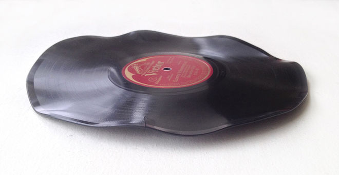
One of the LP records Johnson baked to create the film's eerie soundscape.
I took old public domain classical recordings and chopped, looped, layered and pitch-shifted them, sometimes adding my own auxiliary MIDI keyboard elements. Often Guy would make some loops and atmospheric things in Audacity and we'd trade files and mess with each other's tracks. Sometimes I'd put old records in my oven to warp them just a bit, then record the results and use that as a basis for some compositions. Just anything to create the murky, dreamy atmospheres we wanted in the film. The sound and image seem to work together pretty well. Though I wish I didn't mix the sound on my laptop, with my air conditioner set to high! Rookie mistake.
Do you have a favourite bit of the sequence? A favourite intertitle?
My favourite intertitle is my favourite because of the way it's written, not because of the way it looks. There's a really long, scrolling intertitle that describes in great detail how a man wearing a poison absorbent skeleton appliquéd leotard is being poisoned by a bunch of women wearing poisonous skeleton appliquéd leotards. The writing is always the most important thing. An intertitle that says "Forced to wear a leotard!" is going to be great no matter which novelty old-timey font you use.
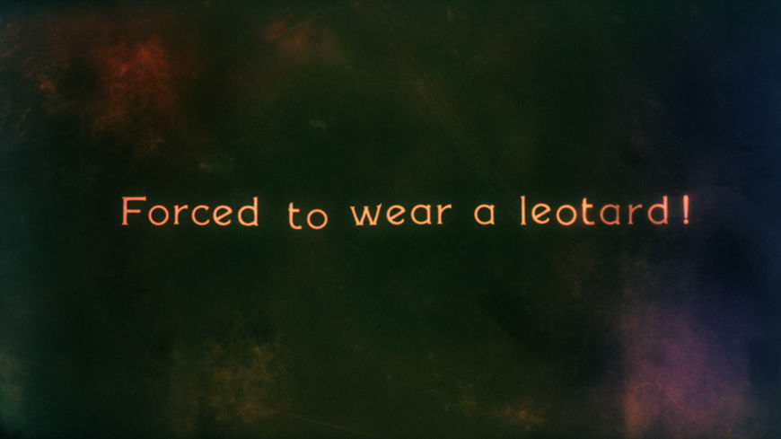
"Forced to wear a leotard!" intertitle
I also like the "Birthday Penthouse" title. For that one I mashed up some fonts from that Italian silent comedy Pick e Puck and a border from a 70s Finnish soft porn movie called Sensuela. They just seemed like two styles that no proper designer would ever combine. The best intertitles made me feel a combination of shame as a designer and pride as an artist.
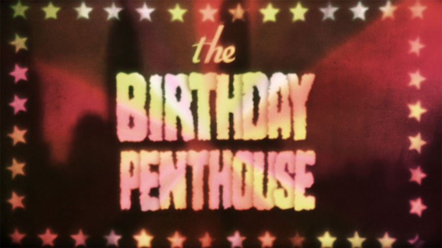
"The Birthday Penthouse" intertitle
What’s next for you?
I just finished, with Guy and Evan, a behind-the-scenes documentary of Paul Gross's recent Afghan war pic Hyena Road. It has some pretty heavy post-production and type treatments as well, although in a totally different way than The Forbidden Room. For the next few months I'll be working on the Seances website with Evan and Guy and John Gurdebeke, the editor. The Forbidden Room sort of forced Seances on to the backburner for a while and now we finally have time to get back on it.
What are some of your personal favourite title sequences, whether classic or contemporary?
Right now I really love this opening of a 1980s Japanese film called Virus – it's really just a title card rather than a whole sequence. I love how the clumsy cropping of the title undermines the gravitas of the sequence. Plus it's just a really strong image. I wanted to include more intentionally bad cropping in The Forbidden Room but I was warned that broadcasters will reject films if the text falls outside a certain safe zone, so I chickened out.
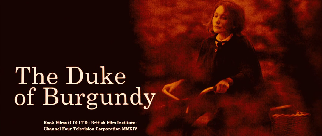
Duke of Burgundy had really nice opening titles.
The Duke of Burgundy (2015) opening, designed by Julian House
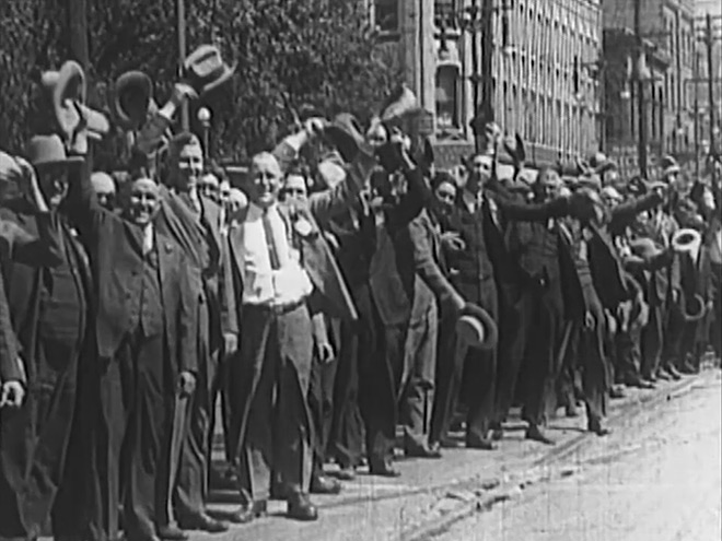
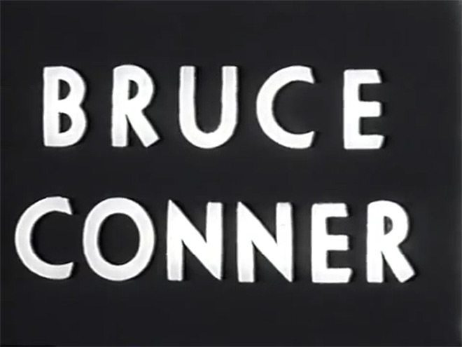
I like Oscar Micheaux's title sequences, mostly for the spelling mistakes, and the generally horrendous condition they're in. Decker. Those Don Hertzfeldt Simpsons credits were insane. Inland Empire, though that one is just a title card. But what an ominous title card! A Movie, by Bruce Conner.
A Movie (1958), directed by Bruce Conner
What excites you outside of design?
Napping. Tap water. Scandinavian jazz.

