“Beauty is vicious” reads the tagline for The Neon Demon, director Nicolas Winding Refn’s latest arthouse genre experiment, a film that somehow walks the line between gut-busting satire and stomach-churning horror. Elle Fanning plays Jesse, an aspiring model trying to make it in the cutthroat LA fashion scene – a place where beauty and success must be paid for in blood and tears, but mostly blood. This is a Refn joint after all.
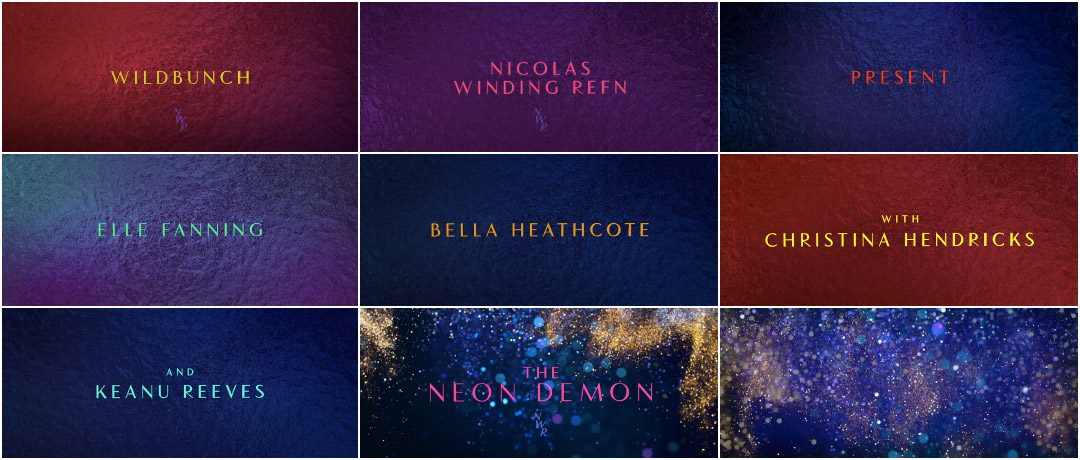
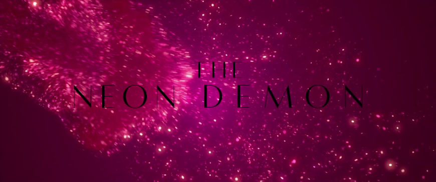
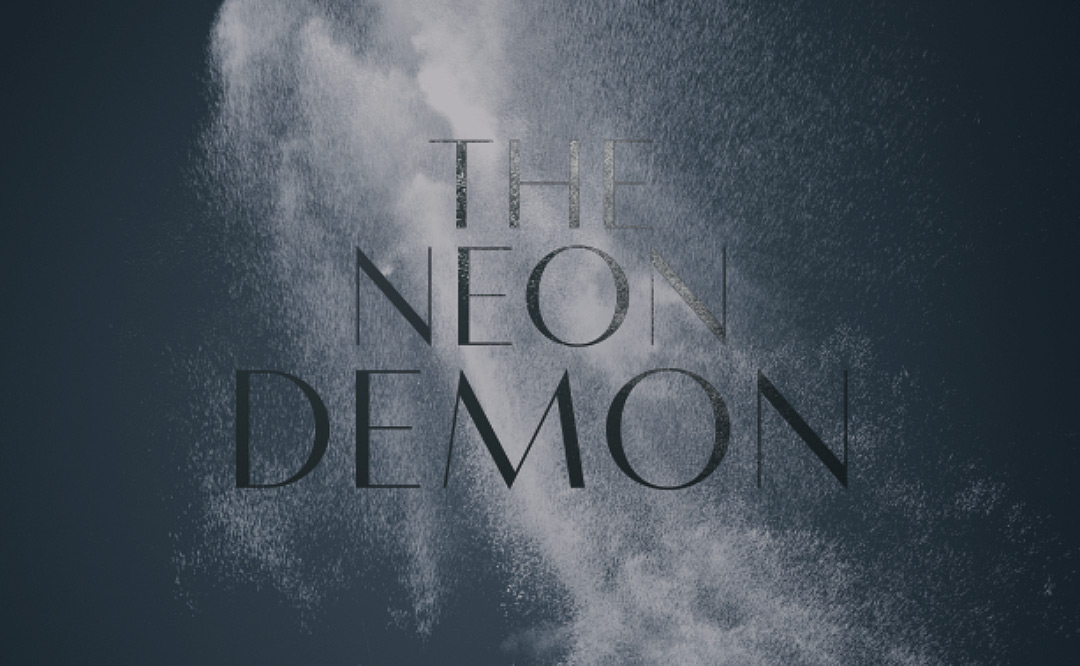
True to its slogan, the Neon Demon opening title sequence presents a sparkling facade that masks something sinister and dangerous, much like Fanning’s enigmatic protagonist. Produced by filmmaker Ben Ib and London’s AllCity, the opening titles deftly mirror the high fashion styling central to the film. Elegant credits contrast sharply against a transitioning coloured backdrop – purple, blue, and many shades of red – key shots stamped with the Danish auteur’s signature branding: NWR. Composer and frequent Refn collaborator Cliff Martinez’s title track twists and rumbles throughout, the shower of glitter that reveals the title card hinting at what this beautiful, vicious film has in store for viewers. It ain’t pretty.
A discussion with Title Designer BEN IB and Executive Producer DAVID FROST of AllCity.
David, could you give us a little background on AllCity Media?
David: We were established in 2000 and concentrate on film advertising as a creative agency. We specialize in film campaigns, working through distribution and production side. A lot of our work is working with filmmakers and the partners who bring the films to film markets, and a lot of our work is also downstream to the distributors working on the same film at different parts of the journey. So it’s mainly film campaigns, individual key art, teaser material, whatever is needed.
Ben, much of your current work is in fields adjacent to title design. Could you give us a little background on yourself and what you do?
Ben: Funnily enough I started out in this field. When I left art school I started in a post house in Soho doing film trailers, typography, and titles, but that was a long, long time ago. Then I started a career making music videos and the odd TV commercial as a director with Colonel Blimp and Blink in London and did that for around seven or eight years. I was making videos for UK artists like Kylie, Calvin Harris, The Ting Tings, and Roni Size.
‘Riot’ short film designed and directed by Ben Ib which informed the Neon Demon end title sequence
Ben: In the last few years I set up my own studio, and my main clients are largely from the music industry. For example, I’ve done quite a bit of work with Paul McCartney; an album cover, animations, short films, CG stuff. I have a lot of experience with blending ideas and post and CG techniques. I guess that's what I usually get called up for. And now film stuff again – I’ve gone full circle!
David, what’s the working relationship between AllCity and Ben and why was he right for this project?
David: We’ve known Ben for many, many years. We’re basically old friends and drinking buddies. We’ve worked on various things in the past, including an ident for Radius TWC with him a few years ago. We’re always looking for opportunities to work together. It just so happened that he was of Danish heritage, but when this project came in we immediately thought of him. He’s closest to us as far as someone who knows CGI but also close to us aesthetically. You need someone who has similar tastes if you’re trying to do something that requires a lot of finesse like this does. Nicolas [Winding Refn] has a specific taste as well. You’ve got to know that you all get it.
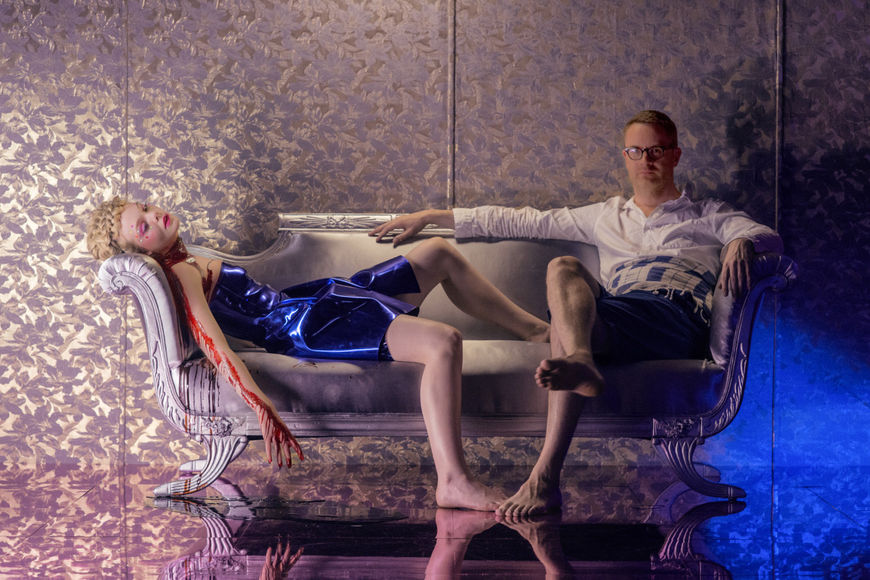
The Neon Demon star Elle Fanning and director Nicolas Winding Refn on set
So how did AllCity first become involved in The Neon Demon? We understand the agency has worked with Refn in the past. Could you tell us about some of that work?
David: We first started working with Nic on Only God Forgives. We did the UK campaign and we did a special poster, a screen print release. One of our clients, Gaumont, had his next film, The Neon Demon, and approached Nic and mentioned us. “So can you deal with Nic?” It doesn’t happen very often that a client says “Can you and the filmmaker just crack on?” It’s a bit of a dream come true to be honest.
We’ve worked directly with the filmmaker in the past. When we did a film called Four Lions we worked with director Chris Morris and we were just keeping the distributor informed. That was also the case with Neon Demon. So we got on the phone with Nicolas and he said “The poster you did for Only God Forgives was my favourite one!” From there we knew it was a match made in heaven. When working with someone like Nicolas, it’s so important that you and the director get on. He’s got a vision and we have to try to extract that vision.
You weren’t initially hired to do the film’s title sequences though, right?
David: We originally devised a teaser poster with him for The Neon Demon – a poster with a big pair of lips on it and an LA scene at the bottom – working from the script stage. That was over a year ago and at that point nothing had been made. The script could have really changed, but we were sort of left to work out what the tone could be.
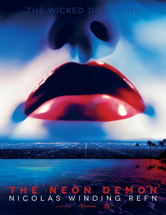
The Neon Demon (2016) teaser poster, designed by AllCity Media
David: During all that we were discussing some of his other side projects. We did a Terminator soundtrack for him, we did the Bronson soundtrack, and then we did his motion identity for his production company. As we were working through all these different projects he was like “I want you guys to do the title sequence.” It was something I’d pitched to him way back not really thinking that it would happen. “I’d love to do the title sequence for Neon Demon when you’re in a position to talk about it!” Sometimes title sequences are such a last minute thing that they end up doing in the edit suite – simple typography over footage or something – but here he was like “Yeah, let’s do the title sequence.”
So tell me about that first meeting to develop the Neon Demon title sequence.
David: Back in November 2015, we went out to Copenhagen to meet with Nic and producer Lene Børglum to talk about the brief and watch a 90 per cent finished cut of the movie.
Ben: I am half-Danish, so it was obviously going to be fun. I love the pastries, so it was a win-win situation! We came out of the screening room with our jaws on the floor – it's obviously a really compelling film. We saw the film before the Cliff Martinez soundtrack had been added. It was quite different. I guess it kind of felt more Hitchcock, but we knew it was going to be something really special.
The Neon Demon (2016) theatrical trailer
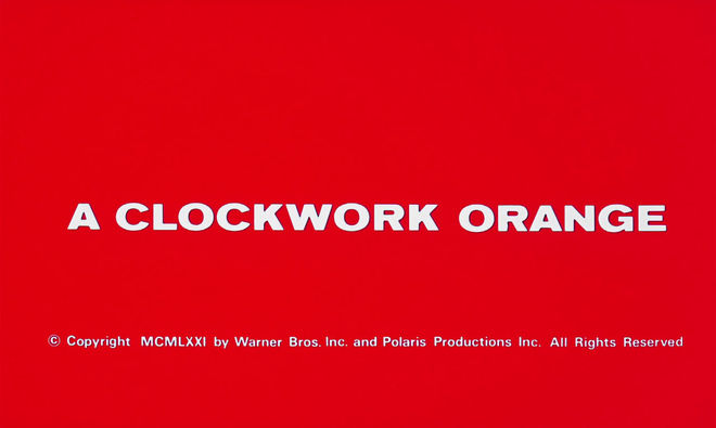
David: We met with Nic and Lene afterwards and talked through some reference material. He had the title sequence from A Clockwork Orange and he really liked that it was all colour – it’s just these blocks of colour. It’ll be really simple. We don’t know what the soundtrack is going to be, but it’s going to be really good. We went away from that meeting and thought about how to approach it. Of course, you need to give it that sort of Nicolas swerve, and that meant that the colour has to be really strong, it’s got to be really vibrant. From that point we devised a look and feel – what are the colours? How does it work?
A Clockwork Orange (1971) main title sequence
David: The Clockwork Orange sequence is a very short sequence, but with this we had a lot of names that we had to include. So we spent a lot of time with Nic going through what the pacing would be like, how long do these names need to be on screen, and how the colours transition between them. At this point we still didn’t know what the sound was going to be like, but the main conversation was about colour and timing.
The brief from him was that it’s got to be “really fluffy”. You can take that in many different ways, but he wanted it to be really fluffy, almost cosmetic-like. So we discussed adding the little NWR logo on there. It comes like a brandmark, like a cosmetic brand or whatever. There was a lot of discussion about where to bring the NWR logo on, where does it disappear, and we decided that it comes on at the beginning, then disappears for the names, and then comes on at the end almost like a sign-off. So yeah, at those stages it was a lot about colour and timing, etc.
Could you tell us about the original concepts for the title sequences and how they were developed?
Ben: Initially the main title was just going to be a single card, just a look with credits superimposed over the edit. My original idea was exploding makeup. But as Nic and editor Matthew Newman played with the edit, it became apparent that a full sequence would build the tone in a much more cerebral way.

Image set: Initial "Fashion Editorial" treatment by Ben Ib
Ben: Originally I put together a PDF that was like a fashion editorial. I had just finished a short CG fashion film at the time and had been doing a lot of experimenting with a kind of cold, dead fashion look, which was extremely fortuitous at the time! I really wanted to bring some of these ideas, which were fresh in my head, to the table. I’d also just finished a Louis Vuitton Project so I was in quite a fashion place. AllCity had some very strong ideas on the design side and it was a question of marrying the two.
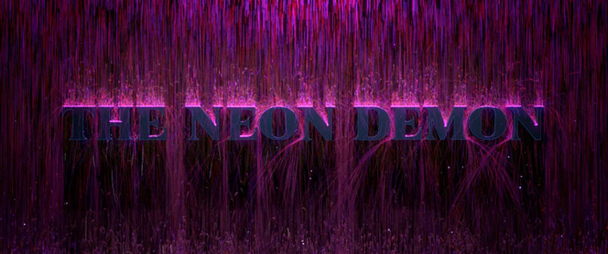
David: Imagine you’re in a posh hotel foyer, you’ve got the name of the hotel on the wall and it’s got a waterfall of glitter that’s just constantly flowing. Imagine that if you can! We did a test of that, but it was all too fussy, too CG.
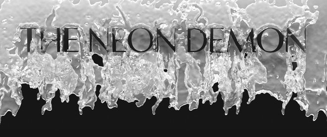
Early CG fluid and particle tests by Ben Ib
Ben: After two weeks of serious geekery and particle dynamics it became apparent that it was a little too clever for its own good and best left. Thankfully, at this point Pete Hanson saved the day, coming up with a really majestic, much bolder route that provided a way out of the quagmire.
David: We got rid of the idea that this was a wall and just worked with it as if it were floating in space. The waterfall effect is where it started with the glitter, but we just took away the noise and left the glitter. It didn’t hit the title and bounce off or anything like that, it was purely over the top and behind it. There were other ideas, but it was really down to wanting to do something dark and deathly at the back with really vibrant colour. That was really the main pitch point for us.
Once the concepts were approved, what were the first steps in the production process?
David: Once we’d pitched this idea of glitter falling, which Nic was well into, the discussion became “OK, well how do we do that?” Ben is brilliant and worked out a way of producing the glitter so it looked real. He used a mixture of CG and real footage.
Ben: There is a tiny amount of stock in there – and we did shoot some glitter in my studio – but most of the material is rendered. I’m often addicted to finding a rendered look for something that could probably be made with an iPhone in minutes. I'm sure Dave would concur!

"Disco Dust" title concept, designed by AllCity
David: There’s some beautiful stuff online that you can use, but you can’t really play with it. You can’t make it larger because you’ll lose the quality. Obviously with the CG, Ben is referencing real glitter falling to create his CG version, knowing that we can blow it up to whatever size we want.
Ben: As it was very much a CG piece it was a lot of late nights in dark rooms. This is par for the course with me and I love getting my teeth into a new project. My background is directing so I enjoy standing back and viewing the whole and then diving in for the detail. So it was a long period of throwing clips back and forth between myself and AllCity. Nic was heavily involved and knew exactly what he wanted, what he liked and didn't like.
So we've talked mostly about your work on the main titles, but at what point did work begin on the end titles?
David: So whilst all that’s happening we also have the end sequence that we’re developing. Nic left the end sequence 100% down to us.
The Neon Demon (2016) end titles (placeholder audio)
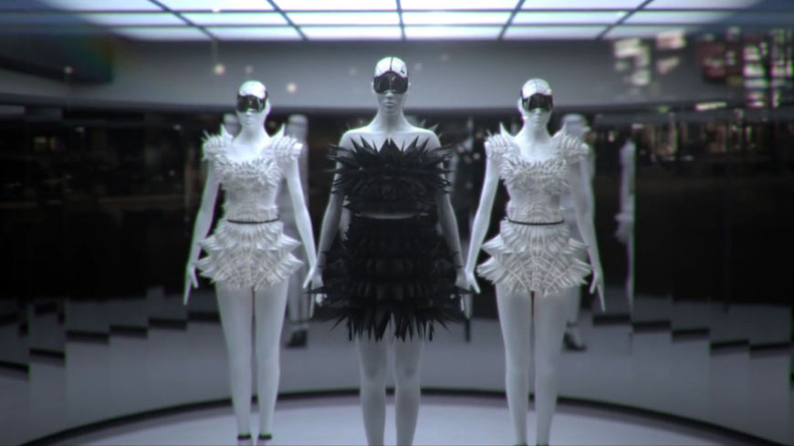
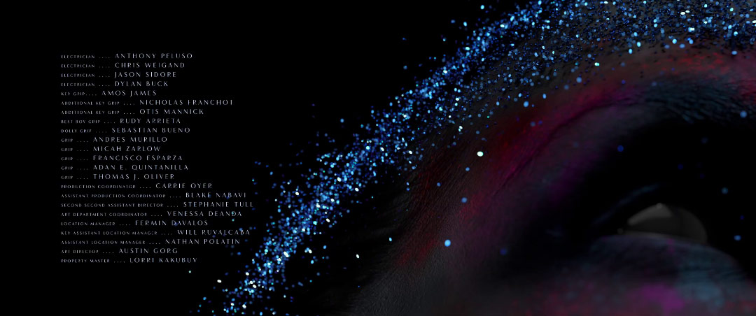
David: Our project on the end titles starts where it says “For Liv”. All it is is simple typography, simple colour, and then into the rolling credits which was purely an idea we pitched about someone being dead being dressed up again with makeup. Charcoal black skin just being remade, which obviously ties in well to certain aspects of the film. The pictures would move at their own pace, while the text would move at its own pace.
Ben: I’ve spent a lot of time in my career shooting models and lighting product shots. To build these entirely in CG I was able to put my experience to practice and get immediate results. Although there is something quite eerie about dispensing with real people entirely! I guess the freedom meant there was less pressure with these sections and I always relish the chance to go to town with an idea.
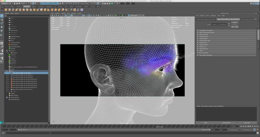

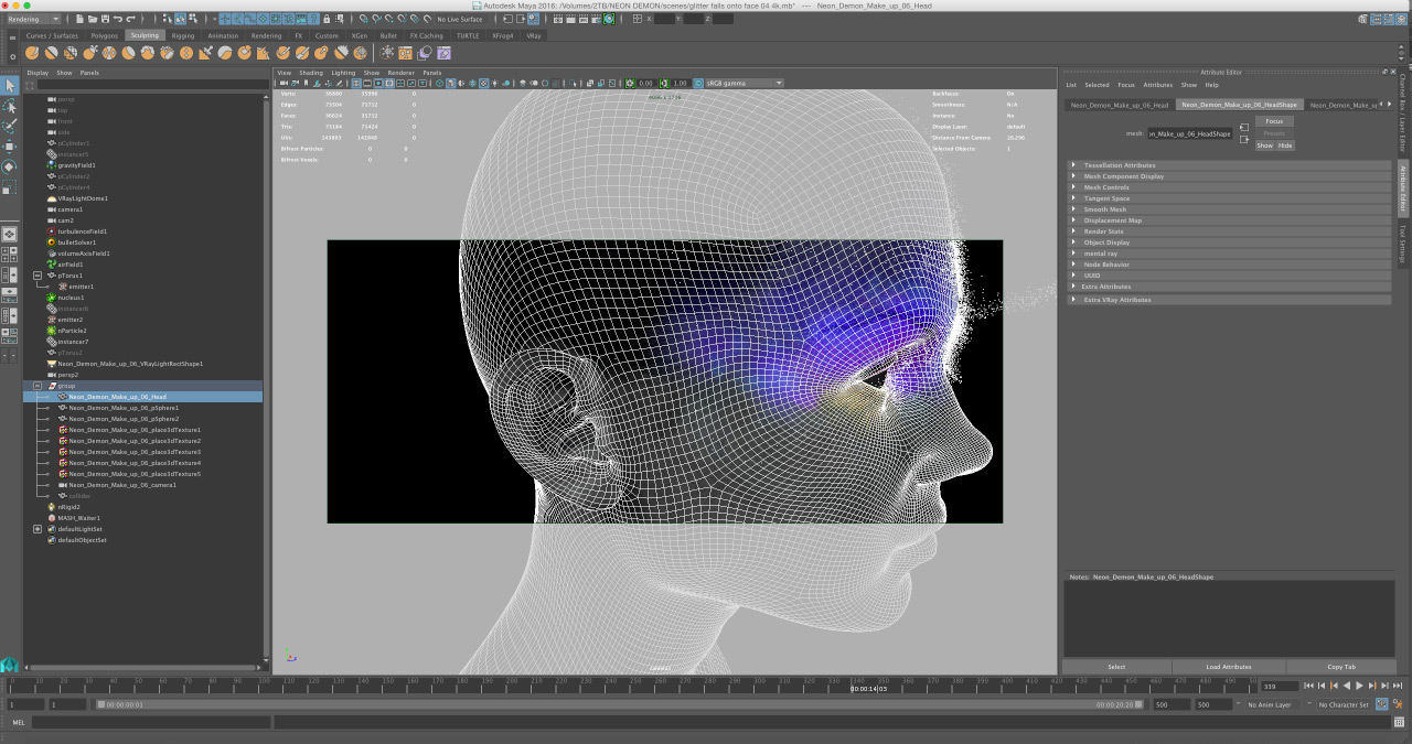
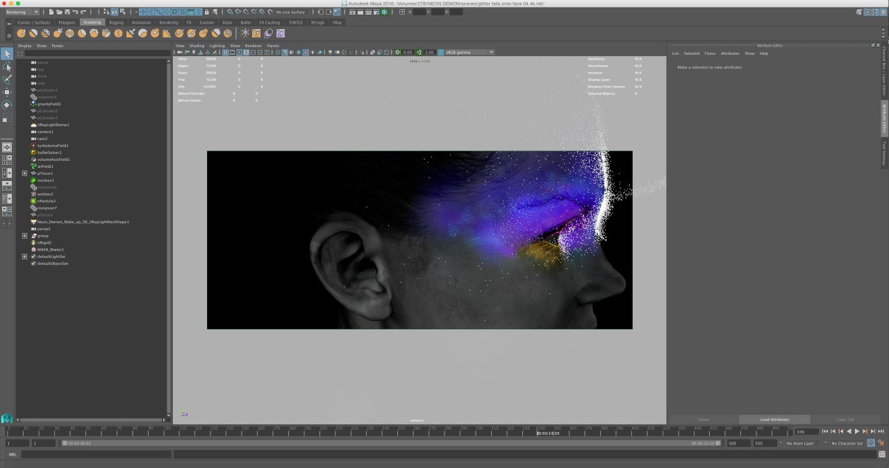
Frames from the Neon Demon end titles being edited in Maya
David: Nic was like, “Just do what you want and go for it.” We showed it to him and he was like “Brilliant. Done.” So that was really cool! [laughs]
That’s unusual to get that kind of carte blanche from a filmmaker…
David: Yeah! Well, I think with the end it’s almost a luxury to have something happening with rolling credits. Whereas it was really important for Nic to have the main title, to start the movie in the right way with the colour and the falling glitter. It all had to work together. Right at the end Cliff Martinez put the music in, we did a bit of retiming on the animation to get it all working together, and lo and behold it did.
Let’s talk about the music and the role it plays in the sequences. Martinez’s score is such an integral part of the film – as it has been in all of Refn’s recent work. Were you able to cut the sequences to his score or were you dealing with a temp track as is often the case?
Ben: Yes, we were working with a temp track. The moment when Cliff delivered the music and we put it over the picture for the first time was exhilarating to say the least. He seems to be able to explore a single musical gesture and then extract its central core, unlock it so that it gets under your skin, over a long drawn out space of time. I think that must take a lot of courage and persistence. Musically that’s kind of what Nic does visually, which is I think why the partnership works so well.
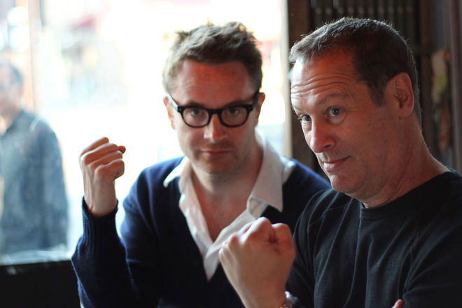
Director Nicolas Winding Refn and Composer Cliff Martinez in 2013
David: At some point we gave Cliff a rough cut of where we were at, something that sort of explained how it worked. I’m not quite sure if he’d created his theme tune prior to what we’d done, but we did have to adjust our animation to hit the points of his track. He tweaked it a bit because there’s that point where the title card appears where it has to hit, but I like to think it was all by design. [laughs]
So how big was the production team?
Ben: In terms of CG operators there was me, and then the designers over at AllCity, and there was some finishing done by the post house, ACT 3, in Copenhagen. So it was a relatively small team, primarily because the whole thing started out as quite a simple brief.
Which tools and software did you use to put it all together?
Ben: I worked in Maya, Mudbox, and After Effects – my usual trinity. For the fluids I used Bifrost and the particles were done with nParticles and bullet physics. It was rendered in V-Ray.
Was there anything that took you by surprise when working on this project?
Ben: I could say the amount of late nights and the nail-biting stress required to make a million particles flow over some type in a beautiful way was a surprise, although I’d be lying. No surprise at all!
David: This was our first title sequence, as far as anything that’s worth chatting about. I would say that the learning curve was quite steep on this. It’s the interesting, geeky things like having to change our initial idea of the transitioning colours. Nicolas likes incredibly vivid colours, but trying to transition calmly from one to another does pose problems. You get banding, you get strange effects between certain colours. That was a continual issue for us. We added things like grain and texture to work through it, but the banding was an issue because the colour was quite flat.
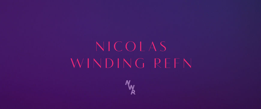
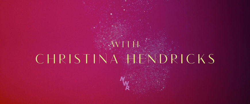
Examples of the earlier "flat colour" title cards
David: We were right down to the wire and still had the banding, but what we did in the end was go away from the flat colour and towards a much more luxurious to look at, like a material, a foil or something like that. That’s how we ended up with that sort of crumpled foil background that you don’t really know what it is. When we were first working on it, it was just a nothingness, just colour, whereas now you have something. It looks like it could be a mirror, it looks like it could be a material, it could be something metal or luxurious, but you don’t know what it is. That enabled us to go through the colours without having the technical issues we’d been having. It was a day before when we were finally like “This is it.” Nicolas was totally cool and patient. “What do we think?” When we put it together we really hoped it would fly, because it was a big departure from the flat colour. Thankfully the response from Nic was “Love it! Let’s go.”
Nicolas is really collaborative – he’s not tutorial in any way – he has good ideas but he wants to know what your ideas and opinions are. He’s pretty much colourblind with certain things. “Nic, that’s just a ridiculous combination of colours!” Wanting to put bright red on bright blue? No one can see that!
What element(s) of the sequences are you most happy with?
Ben: I am most happy with the end credits, I think they were a joy to make and came out pretty much exactly as I intended.
David: I’m totally pleased with the end sequence. I’d be happier if everyone stayed in the cinema to watch the end credits, but you don’t often get that! [laughs]
In the main title sequence, I really like the transition from the Keanu Reeves card into the title when the music changes. It goes from a fluffy blue to the very twinkly title card, and it’s then that the change of tone is very clear. It could have been in danger of being fluffy everywhere, but it needed to have a darkness to it and I think we managed to get that. I think it works a treat.
It’s rare for one studio or agency to work on the entire visual identity and marketing campaign for a film, but AllCity did theatrical posters, magazine ads, and the titles. What are some of the benefits of doing all that under one roof?
David: Neon Demon was a big project for us. We started off with the teaser and then moved into doing the campaign for the UK. We were fortunate in that because we’d created the assets from the teaser, from the titles, and we were able to utilize those assets throughout our materials. It was really good to see the title materials being used in the trailers. They used our CG, our title treatment, the text and the colours. The titles we did proved to be useful beyond measure.
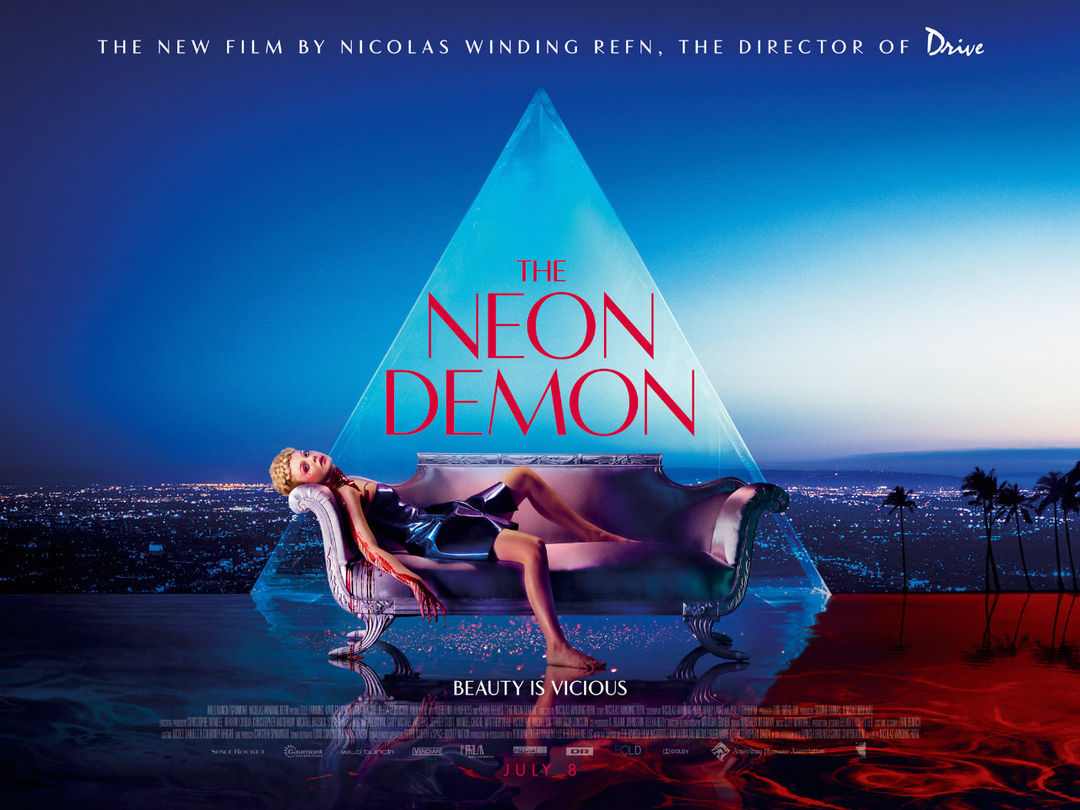
The Neon Demon large format poster designed by AllCity
David: We also did the vinyl soundtrack for Neon Demon. For that we did this big cat’s face, a big centre spread, and we said “Why don’t we use that for some other things?” So we used it for some teaser stuff with the copy line “Beauty is vicious,” which became our tagline for everything.
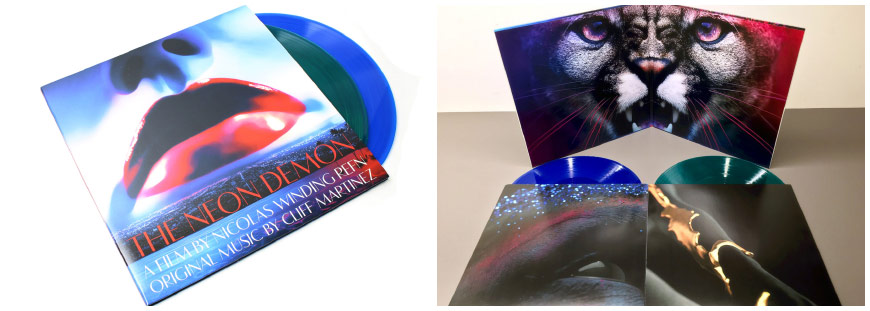
Image set: The Neon Demon OST LP sleeve, designed using assets created for the teaser poster and end titles.
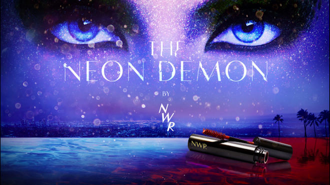
David: It all comes together in one package and it has a coherent branded look. You don’t often get to do all aspects in-house. We can be really reactive that way. We built up a look and feel from the teaser poster. We understand the film. Why don’t we use these materials we didn’t use on something else? For example, we did a fake cosmetic ad campaign based on the film. “Why don’t we do some fake ads?" Let’s do it. Just us. When you have the materials at hand, it’s just a question of coming up with ideas and you can do it and do it quite quickly.
An example of the faux cosmetic ads created for The Neon Demon
David: For independent film I’d say that’s rare. Quite often you don’t get those materials created because they either don’t have the budget or the time to do things. When you suddenly find that you’ve got this coherent message across the board, it's brilliant. You’re using these titles in other ways and maximizing your assets. It really ups the production level and the perception of a project.
What are some of your personal favourite title sequences, whether classic or contemporary?
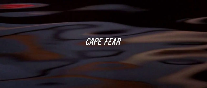
David: As far as modern sequences go, they can be so overcooked because you can do anything. You can just put layer upon layer upon layer of stuff. I always think of sequences like Cape Fear. Title sequences that have something real in them but also really nice graphic design.
Cape Fear (1991) main title sequence, designed by Elaine & Saul Bass
David: That’s the stuff I like from back in the day. I’m drawn to the simple sequences, simple type working with a bit of an idea, like the sequences from Sam Peckinpah movies.
What about some of your favourites, Ben?
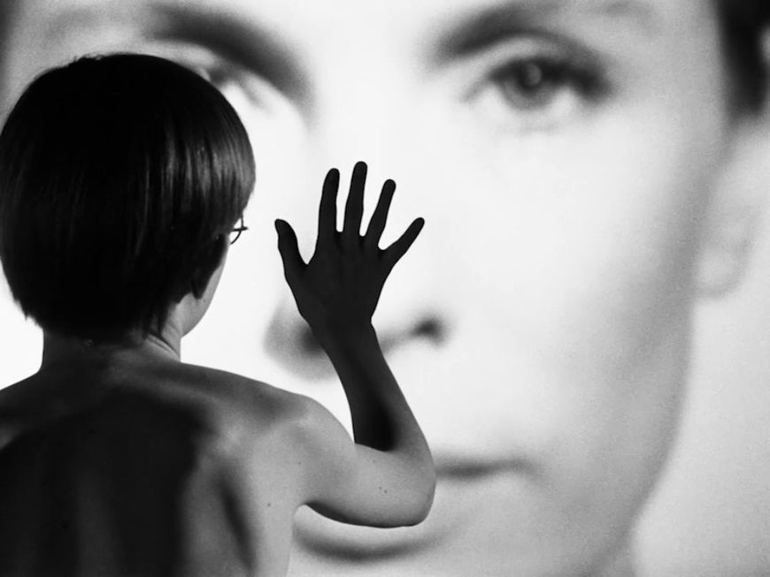
Ben: In terms of cinema, my favourite opening sequences are probably Ingmar Bergman’s Persona and Luis Buñuel’s Belle De Jour. They force you out of the place you are in and firmly place you within landscape of the movie. A rare thing these days.
Persona (1966) opening sequence and main titles, directed by Ingmar Bergman and edited by Ulla Ryghe
Ben: In terms of ideas, my guilty pleasure would be Airplane! or Napoleon Dynamite. In terms of graphics, it would probably have to be North by Northwest. But for simplicity, Rosemary's Baby or Blue Velvet or most Woody Allen films, precisely because they resist the temptation to overplay the visual, to great effect. I could go on and on. Usually when I watch a film and the title sequence is too good – this is a bad sign! Hitchcock is the exception to this rule. I go in and out of love with film titles. When I was 16 I used to have a pile of VHS tapes full of title sequences which I would record and watch all in one go. So it’s a long-rooted obsession!


