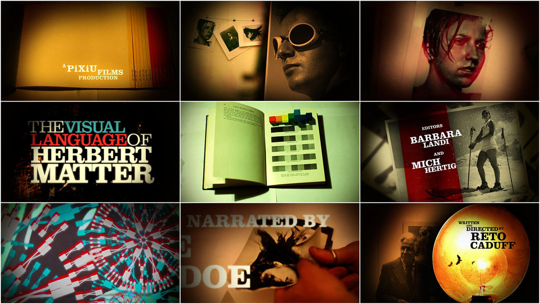
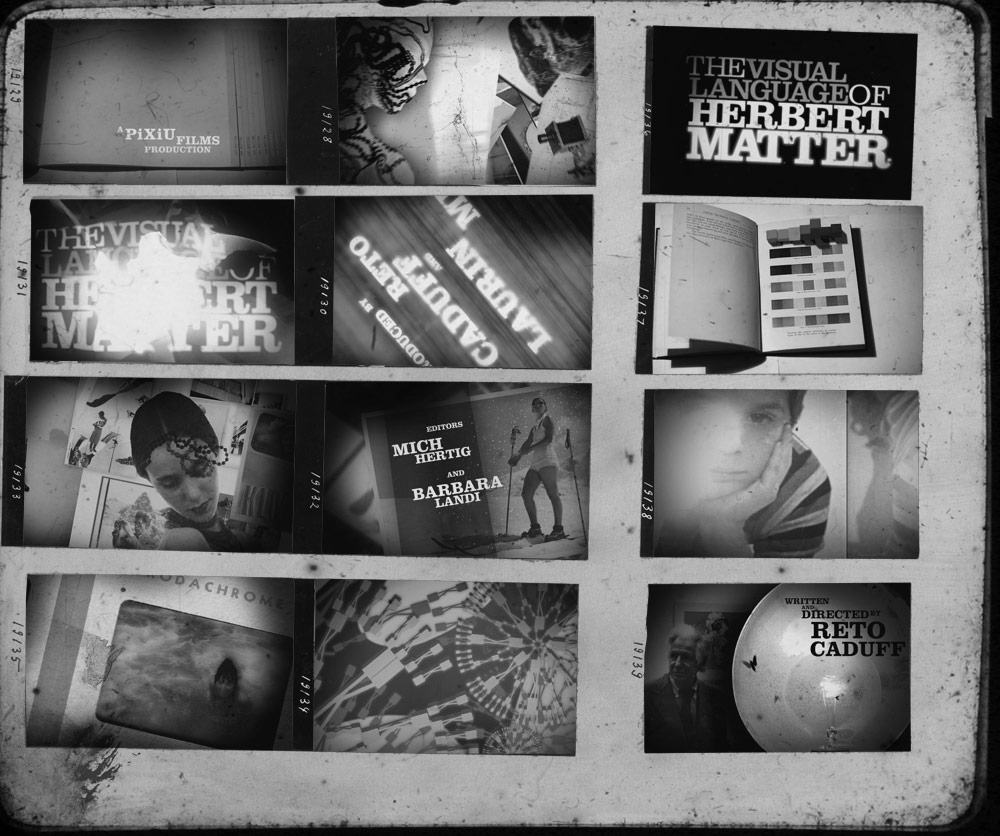
leftchannel's opening title sequence for Reto Caduff's The Visual Language of Herbert Matter, establishes the circulation of a documentary profiling the remarkable creative variance in design, photography and film of the titular AIGA Medalist bringing an almost forgotten genius back into focus. It is a remix of Matter's remarkable creative variance that smartly retains the clarity of each medium giving the uninitiated a budding sense of the artist unbound.
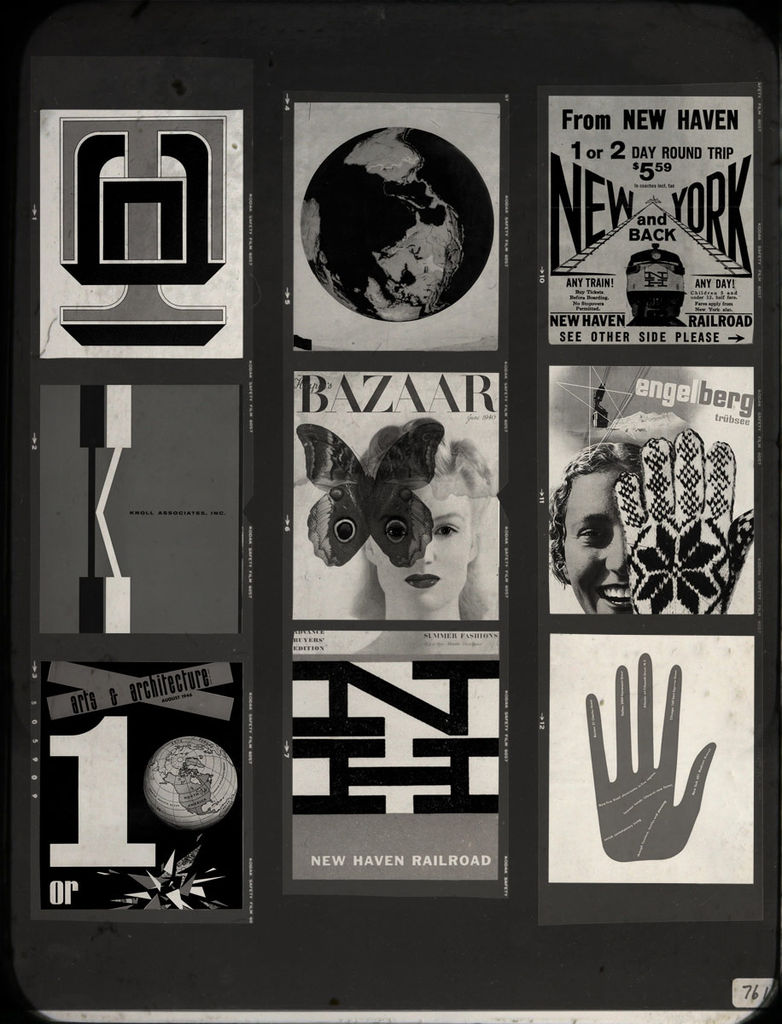
The works include Matter's iconic Swiss travel posters, pavilion designs for the New York World’s Fair 1939, photographs for Condé Nast publications, corporate image programs for Knoll furniture and the New Haven Railroad, designs for the Museum of Modern Art and the Guggenheim Museum, covers for the legendary Arts & Architecture Magazine and imagery from his lesser known work in film, the prime example being a film on the works of Alexander Calder.
leftchannel Art Director and Animator NATE REESE details the creation of the title sequence for us.
NR: Reto Caduff approached leftchannel in middle of 2008 asking us to help out with a documentary he was in the process of making. He had just seen the "1976" video we did for RJD2and was looking to incorporate a similar parallax technique. We have several documentary fanatics in our studio so we were extremely excited to have this opportunity to work on one. Reto revealed that the documentary would be focusing on the life of one very influential artist and designer Herbert Matter. We expressed interest in helping with the title sequence - another dream of leftchannel's. Reto was happy to have us aboard.

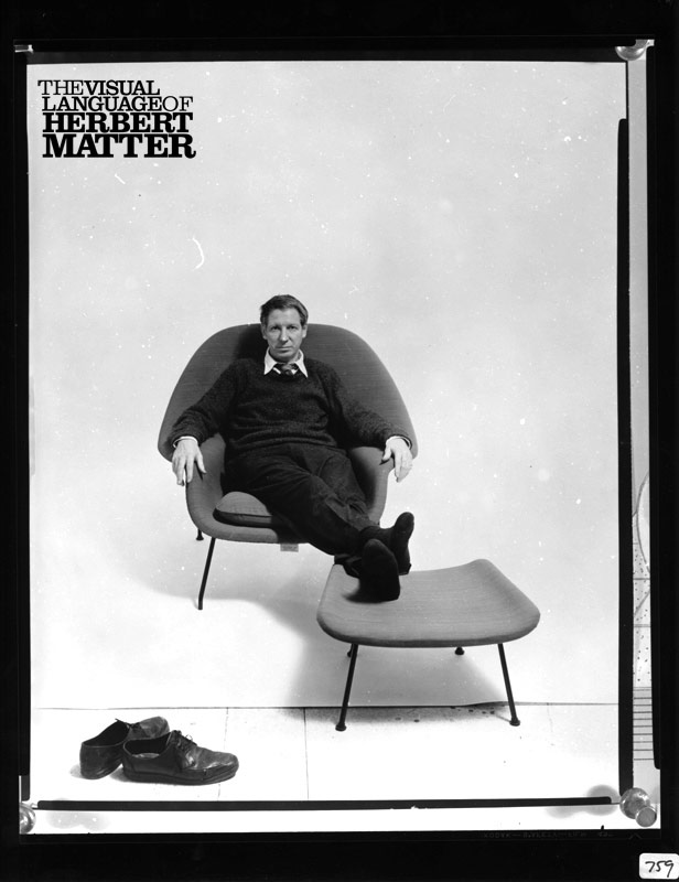
Herbert Matter portrait
Several weeks went by after our initial discussion and suddenly some hard drives arrived via FedEx. Apparently, Reto had been scouring the globe - painstakingly scanning and cataloguing anything concerning Herbert Matter. The drives contained hundreds of gigabytes of images and films. The content ranged from family photos, Vogue magazine covers, personal letters, logo designs, and more. Just absorbing all of the content included became a task spanning several days.
Once we had finally come to grips with everything supplied, we had a chat with Reto to talk about the general mood of the titles. He went on to explain that this project was personal for him. He was in a process of discovery of sorts. There was so much content out there, yet there was no real definitive biography on Matter. Reto was putting together a puzzle of sorts, picking up pieces along his travels. He wanted to feel that mysterious type of journey within the titles.
We also discussed bringing a part of Matter's creative process to the credits. Historically, he's best known for his use of photographic work in design, so we decided on shooting darkroom setups to be included throughout the sequence. Reto headed this up and the footage turned out beautiful. It had a wonderful nostalgic feel to it. We ended up incorporating a good amount of it into the title sequence. All of the darkroom footage was shot in Reto's kitchen using a Canon 5D Mark II. The enlarger / flash bulb were purchased on eBay a few days before the shoot.
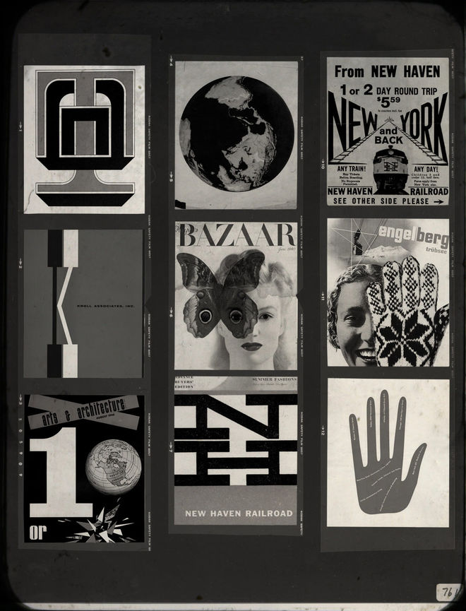
Herbert Matter work examples
As we started work on the titles, the first discussion we had was about which typeface to use - arguably one of the most important design decisions you need to make in a title sequence project about a prolific designer. We wanted for sure to use a typeface that Matter would have approved of. We settled on Clarendon, as it has a nice historical presence and Matter based some of our favorite works off of it.

Original storyboard
Herbert Matter's expertise and career covered a broad range of techniques and subjects. We wanted as many of these unique facets represented in the titles. We spent many additional days going back through all of Reto's archives and cherry picking our favorite images across all the categories to use as collage elements throughout the piece.
Next, we started experimenting around with simple atmospheric studies + type builds. We presented several different styles to Reto, getting his input on which would be the most appropriate for the a documentary about Herbert Matter. Eventually, we settled on a fairly simple build structure, but felt that this was more reflective of his work.
Alternative type builds
For the main title build, we were adamant about the type simply appearing on screen. We felt this added greatly to the impact of the main build, as well as giving a nice vintage feel as we were concerned with scenes looking too "slick". We wanted the titles to feel as if they could have existed during Herbert Matter's life span. Sort of a "lost in time" feeling.
We also wanted to hint at some parallax, as the technique is used extensively through the film in several sequences produced by another house. The parallax technique is most obvious during the 'Editors' sequence at 00:47. The majority of the project was built in After Effects with a few additional 3D elements scattered throughout.
Parallax technique example
As far as the music, we originally cut to a Massive Attack song to set the tone and pacing. Once the titles were nearing completion, Reto gave them to composer Greg Manning, who did an outstanding job creating an original track.
The creative freedom we were allowed on this project was huge. Reto was excellent to work with and this project truly was a collaborative effort. We were very honored to be a part of this film that sheds a much deserved light on the life and art of Herbert Matter.

