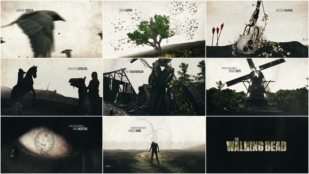
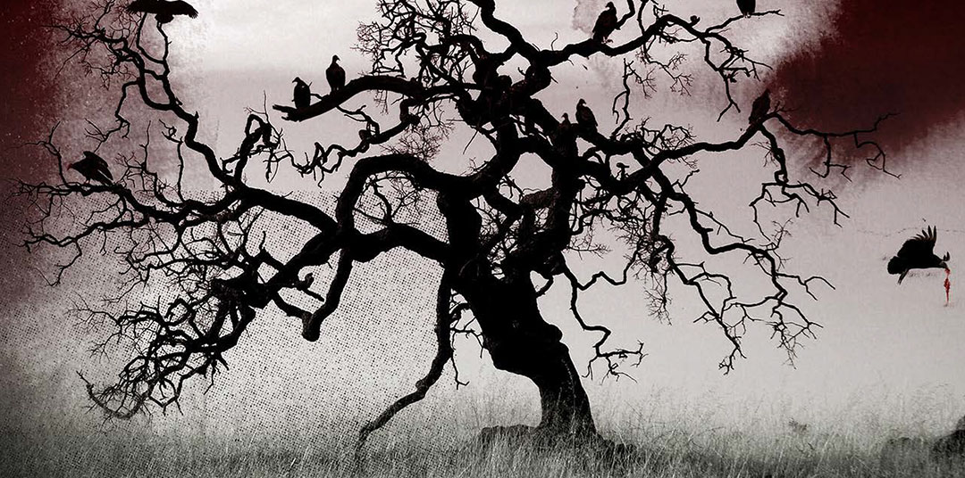
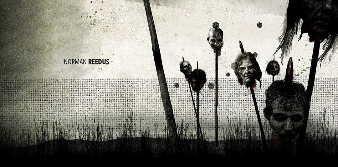
A ruined, decomposing world picked clean by those who remain, harshly rendered frame by frame. Out of that decay comes something new, driving he carrion-eaters away, holding them at bay... for now. For its ninth and latest season, AMC's much beloved horror series The Walking Dead received a revamped title sequence. This completely new introduction – in both style and setting – sets the stage for the next chapter of the post-apocalyptic zombie saga – and the exit of one of its major characters.
Like its predecessors, The Walking Dead's new title sequence remains infused with the requisite levels of dread and doom. Composer Bear McCreary's iconic theme, a key ingredient in conveying that mood to viewers, survives another day, as do the fleeting shots of objects belonging to the show's survivors – Rick's revolver, Daryl's bike, Negan's bat, Michonne's sword – all now overgrown with vines. Time has passed, the situation has changed. Eagle-eyed fans will surely note the many easter eggs peppered throughout the new sequence, portentous details like a sheriff's hat in a graveyard, a waiting noose, and a helicopter's flight. But the new opening isn't simply a litany of winks and nods for the coming season, it also communicates something that may be slightly unfamiliar to Walking Dead viewers after eight seasons of terrible fear and suffering: a feeling of hope, a sense that this could be a new beginning for the titular group of survivors. Maybe.
Produced by London-based Huge Designs (now the third studio to take on title design duties for the hit AMC series), the season nine intro is the most significant stylistic update the Walking Dead's main titles have ever received. Gone are the vignettes of suburban catastrophe and wandering terror. In their place is a focus on one central location: the Alexandria Safe-Zone – a walled-off community offering refuge from the walkers at long last. Working closely with showrunner Angela Kang and The Walking Dead's producers, Huge drew inspiration from not only from the show's previous main titles and the ongoing comic book series upon which the television drama is based, but also pulled from unexpected sources, like an icon of gothic fiction and the work of a beloved stop motion wizard. With those disparate elements combined, The Walking Dead's new title sequence acts as a turning of the page for the show's characters and signals a creative resurrection of sorts for the long-running series.
A discussion with The Walking Dead showrunner ANGELA KANG and post-production supervisor RYAN DEGARD, and title designers TAMSIN MCGEE and PAUL MCDONNELL of Huge Designs.
The Walking Dead’s title sequence has remained relatively unchanged since the fifth season, so I suppose the most important question is why did the production team decide to commission a new title sequence for season nine?
Angela: Creatively, season eight was conceived as the closing of the first chapter of The Walking Dead story. Season nine opens a new chapter, in line with the time jump that happens in Robert Kirkman's comic books. Chief Content Officer Scott Gimple and I spoke over a year ago about the idea of possibly revamping the main titles to reflect that shift in the story.
—Angela KangSeason eight was conceived as the closing of the first chapter of The Walking Dead story. Season nine opens a new chapter.
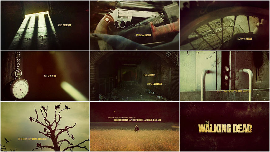
The Walking Dead (2014) season 5 main titles, produced by yU+co
Tamsin: This season is a big change from the previous eight. Not only is it the departure of Rick, but it’s also the first time that there will be a substantial time jump. Angela wanted to reflect these changes within the sequence.
Huge Designs has worked on a number of title sequences for AMC shows like Into the Badlands and The Son. Were you familiar with them or their work at the outset of this process?
Angela: AMC actually recommended bringing them into the pitch process, because they'd had such positive experiences with them in the past. I'm so glad they did. I was most familiar with their work on the brilliant Da Vinci's Demons titles because we have some writer crossover with that show, but I watched their reel prior to speaking with them and was very impressed with all their work.
Ryan: We spoke to a lot of fantastic houses and to be honest, when AMC brought them up to me, I had not heard of them, but they told me how great they were to work with and I hurried away to study their work. I quickly became a fan and was excited to hear their ideas for our main title.
So what was the brief? Tell us about some of those initial conversations.
Angela: I spoke to them on the phone for about half an hour about the themes of the seasons and visuals we were thinking about. I talked about how it was a period of rebuilding, and there would be some mystery, and a Western vibe. I mentioned the murmuration of birds that we see in the first episode, and how we'd be playing with the idea of man-made structures crumbling, but nature creeping back. Life out of death. I told them I kept picturing a skeleton with a tree starting to grow out of it, but made it very clear that they don't literally have to use that image.
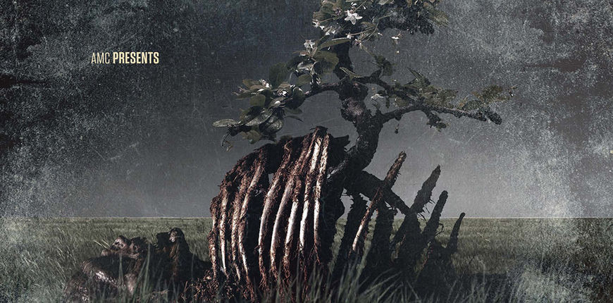
The Walking Dead (2018) season 9 skeleton tree concept board
Tamsin: We loved the strength of that image and looked to build off of it. “Life emerging from death. Nature taking over, while other things are crumbling." That was the fundamental premise of the brief.
Angela: Of course, we do see a skull with a pitchfork through it and flowers vining out of it, so the general idea did make its way into the sequence. Other than talking about generals, I said we just wanted to see interesting pitches and Huge came back with three incredibly strong takes on the material and we started building it from there.
What can you tell us about the concepts you presented to Angela and her team?
Tamsin: Two of them were quite similar to the existing titles and the third was our curveball. To be perfectly honest we were slightly – and pleasantly – surprised that they went for that iteration.
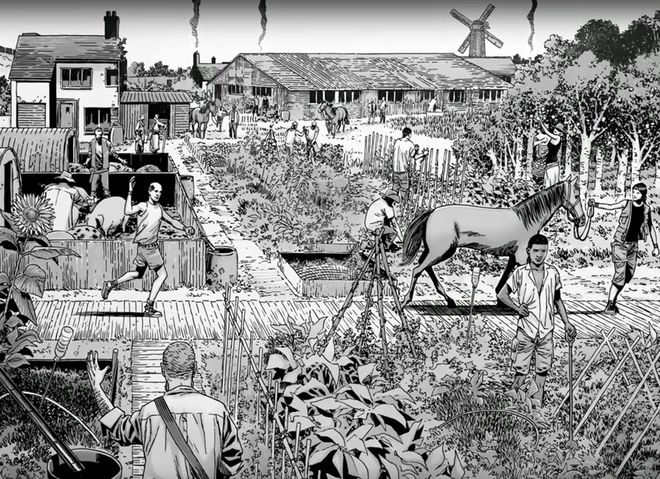
The Walking Dead Volume 22: A New Beginning splash page featuring Alexandria
Tamsin: There is a particularly stand out image in the A New Beginning issue of the comic depicting Alexandria as a utopia. It shows everyone working to build this haven, growing vegetables, raising livestock and planting orchards and it just reminded us of the ranchers and settlers in frontier towns of the 19th century American West. The big skies and low angles of the Western genre became the main overarching influence of the concept.

Image set: The Walking Dead (2018) season 9 concept boards
Tamsin: We chose to sit Alexandria very firmly in the middle of the sequence bookended by scenes of terrible, external wilderness and threat. We started to look at how we could represent the town in a visually exciting way, and once again we looked to the comics for inspiration. Choosing to go monochrome made for visually strong images and pushing the contrast to its inkiest limit – where you start to lose detail and everything is really crushed – was really exciting and a bit of a risk. We added a lot of textures in the pitch, small nods to The Walking Dead’s print matter roots. We had some halftones, print misalignment and paper textures – a lot of that was toned down in the end because it made the sequence too muddy.
Angela: I thought their concepts were incredibly thoughtful and the images were striking. I could tell they'd really listened to what I'd told them but they also weren't afraid to take creative risks. I love bold artistic vision paired with a collaborative nature, so this turned out to be a great match for my own sensibilities and working style.
Tamsin: Another massive reference that helped shape the sequence was the work of Edgar Allan Poe. In our early conversations with AMC, there had been mention of enormous flocks of birds, signifying the regeneration of the natural world. By amazing coincidence, I had an illustrated copy of The Raven next to my paltry Walking Dead comic collection – I have three! We had a little dig around online and it turned out that Poe’s most recurring themes were that of death, the effects of decomposition, premature burial and the reanimation of the dead. Perfect! We used Poe’s description of “a pale blue eye, with a film over it” to introduce the concept in the pitch document and his gothic, macabre tone was a constant stylistic influence throughout the making of the sequence.
Angela: I honestly suspect they didn't think there was any way we'd pick this concept. It was the most different from the titles we'd had over the years, which people are quite fond of internally. They seemed rather surprised but pleased that we went with it!

Image set: The Walking Dead (2018) season 9 concept boards
Angela: Edgar Allan Poe is a huge literary hero of mine, but even if I didn't know there was a Poe influence on the pitch for this sequence, I would've picked this concept because I was immediately struck by the graphic novel-esque feel to the images and I loved that it evoked a sense of classic, American gothic horror. The idea of The Raven in the form of the flock of crows really worked organically for our story, and there's just a nice general macabre feel which we also undercut with images of greenness and growth – I like the tension that exists between those extremes. It feels very right for our story.
How much or how little influence did the titles from earlier seasons have on this latest iteration? Was there a tone or visual language you wanted to maintain – or did you see this as more of a clean break in terms of style?
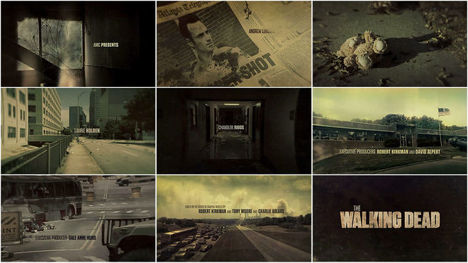
Paul: We really love Prologue and Kyle Cooper's sequence from season one and we wanted to pay homage to that as much as possible while keeping the sequence within our new parameters.
The Walking Dead (2010) season 1 main titles, produced by Prologue
Paul: We mimicked a lot of the camera moves from that version alongside the lens distortion at the edge of frame. We also brought in some of the layering that was used so successfully in the previous versions.
So let’s talk about the production itself – were you left to your own devices once the concept was locked or was there a lot of back and forth with the Walking Dead team?
Tamsin: They were refreshingly hands off. There was a fine line we had to walk in terms of spoilers and we were a bit close to the bone with some of the early pitch images. But once the narrative was established, we were left to our own devices in terms of execution. We were in constant contact with them however and were sending iterations through around twice a week so they could provide feedback.
How would you describe the animation style used in the final sequence? It feels like paintings or frames layered upon one another, which gives the motion of the piece itself a feeling that every frame is being overgrown by the one that preceded it.
Paul: We wanted to make the sequence feel as analogue as possible. An underflowing premise of the new series is the degradation of civilisation and nature reclaiming man made objects. We wanted to go back to the feel of stop frame animation to reflect the step back in technology.
We are massive fans of Ray Harryhausen and felt like a sense of his style could lend itself perfectly to the animation. That combined with the overriding graphic novel theme steered us towards the finished look. Executive Producer Scott Gimple nailed it in one of his notes by encouraging us to keep it "kinda janky."
—Tamsin McGeePoe’s most recurring themes were that of death, the effects of decomposition, premature burial and the reanimation of the dead. Perfect!
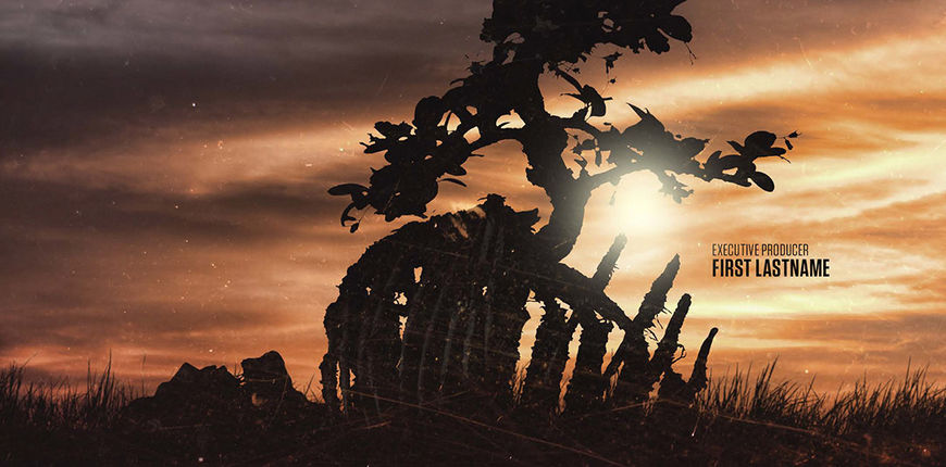
The Walking Dead (2018) skeleton tree concept iteration
What about integrating the theme music? It’s iconic, but it was obviously created for the original title sequence – did you feel constrained at all by having to match your work to an existing theme?
Paul: Not at all. If anything it was the exact opposite. We have worked alongside composer Bear McCreary on a number of occasions and we always find his score brings the sequence to a higher level. The man’s a genius! We also tend to prefer designing to the score as opposed to the other way round. It anchors our edit and gives us a general shape to work to.
There's been a lot of talk about all of the easter eggs in the sequence – I've heard fans are obsessing over the helicopter? I know we don't want to spoil anything, but how was that process handled and how did you decide on all the little nuggets would be planted in the sequence?
Paul: Ah, the easter eggs! I’m afraid if we give away any secrets we will be forced to surrender our first born children – it’s in the contract. However, they all came from Angela and her team.
Angela: The helicopter is an important part of this season, so that was probably the first Easter egg we decided to add into the titles. I credit Ryan for coming up with the idea of including iconic weapons and objects belonging to our characters as a way to pay tribute to the titles we've had for the past several years. AMC didn't want to lose all ties to that history, and this seemed like one really fun way to do it.
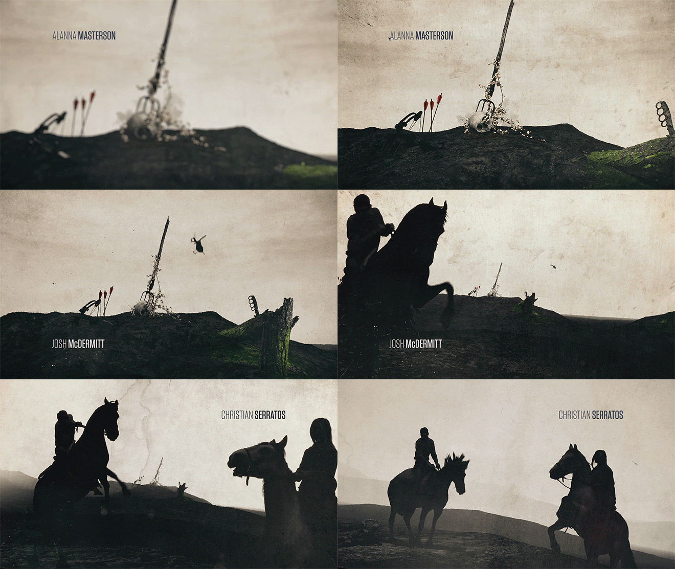
Ryan: As Angela said, we felt that including these Easter eggs was a nice way to call back to the titles we had done in the past and at the same time give the fans something to be able to really dig through the title sequence itself and look for these items. The Walking Dead is a very different show in that it has so many iconic items that you attach to your favourite characters and it brings you an instant recognition as to who that character is in seeing that item. I always loved how fun it was to watch Game of Thrones and wonder what different part of the map we might travel to this week. I thought similarly, how fun it would be for a fan of the show to watch the title sequence each week and maybe notice something that they had not noticed before? We have so many things in there, that even I have had to really search for.
Paul: They knew what they wanted and where they wanted it so it was up to us to make sure they were hidden to varying levels. Some of them are so well hidden that I even have trouble seeing them so I would be surprised if they were all discovered. I think we can tell you that there are roughly 30 easter eggs scattered throughout the sequence. As to their meanings, we are almost as in the dark as everyone else!
Ryan: I like the idea of our main title giving you something new and rewarding you for really studying it. We have even talked about adding more things as time goes on. With a show like this, you have so much that is new on a continual basis, I even have new, soon to be iconic items that I am already excited to add to the main title at a later date, once we introduce the fans to new characters.
What element or moment from the sequence are you most happy with?
Angela: I really love when the tree bursts into leaves and the crows fly away perfectly in time to the first big sting of the music. I find it so satisfying when that happens. I've watched that moment a billion times.
Tamsin: The pulling back of the camera started out as more of a device to get us from one scene to the next, but it actually has ended up being key to the tension of the sequence. It’s like we as viewers are fleeing at speed in the back of a rickety old cart. I wouldn’t say it was a happy accident because it was planned from the start, but Paul’s animation combined with the music adds way more ambience to the sequence than I originally anticipated.
The Walking Dead (2018) season 9 title sequence behind the scenes reel
Paul: I am personally really happy with how close the end result came to Tam’s initial boards. We have never really tackled a piece of animation like this so there was a lot of research and development, however, we were really happy with the end result.
Ryan: Honestly, I love so many parts of it, but I think I am currently loving the vines slowly growing up the pitchfork embedded in the skull. It says a lot about the current world of the show in single shot. You have a walker that was most likely killed years ago at this point and the world is slowing overtaking it and taking it back. You also get the helicopter flying by, which has been a major mystery we have been teasing and it is nice to fuel that fire!
Did anything take you by surprise when working on this project?
Paul: Truth be told we were surprised about the ease of working with Angela and her team. We know that the show is one of the most popular to date, so we had expected it to be a relatively difficult process working on such a behemoth. However, it turned out to be the exact opposite. All the notes given were really productive and helped shape the final animation. There are usual a handful of notes that we feel pushes the sequence in the wrong direction but we didn’t have that on this process.
What tools or software did you use to put this all together?
Paul: We used a combination of Cinema 4D, After Effects and live footage.
What are some of your favourite title sequences – TV, film, whatever, either classic or contemporary – and why?
Angela: I mean, Saul Bass's Hitchcock title sequences are my all time favourites. I love the beautiful typography and simple, striking graphic design. It really evokes a mood and roots you in a time and place and gets you ready to see something dynamic and a little off-kilter. Perfection.
Ryan: I can second that answer, I love classic movie titles and Saul Bass did them so well. In contemporary television, there are so many great sequences, I could go on and on. I will say that I absolutely loved both versions of The Leftovers main title, I think each one captured the essence of that show beautifully and in the case of the second one, so simply!
Paul, I know we've already asked you this question a few times, so I'd love to hear Tamsin's answer: What are some of your favourites?
Tamsin: Kyle Cooper's Donnie Brasco still makes my heart stop – it was really early in my career when it was released and it was so crushingly forward thinking and it just made me want strive to tell stories like that.
—Tamsin McGeeTitle sequences can be like the first line of a novel, setting the tone and drawing the viewer into a different world.
Tamsin: It made me realize that, when done well, title sequences can be like the first line of a novel, setting the tone and drawing the viewer into a different world.

