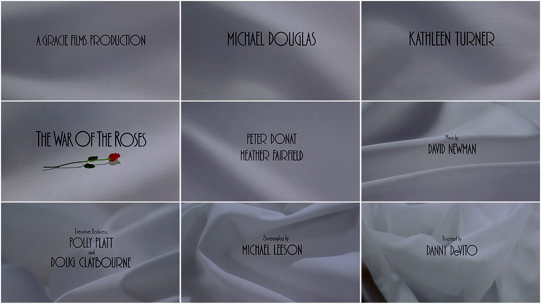
The War of the Roses is Danny DeVito's second excursion into feature film direction, having received accolades for his slapstick comedy Throw Momma from the Train two years earlier. It concerns the courtship, marriage, and, mostly, the comedically bitter divorce of Oliver and Barbara Rose, played by Michael Douglas and Kathleen Turner, as recounted by their chain-smoking attorney Gavin D'Amato, played by DeVito himself.
The ingredients in the Roses opening title sequence are basic: a static, nouveau sans-serif typeface is superimposed over a neutral gray background, soon revealed to be a swath of white fabric – presumably a bedsheet or a wedding gown detail, given the film's premise. Over the course of the sequence, the fabric gains depth and relief, presented at first by subtle gradients and delicate shafts of light, then becoming a contoured landscape of rolling hills. The folds become more pronounced and dramatic over time and by the end, we find ourselves face-down in a crumpled mess of fabric.
The sequence is capped by D'Amato removing the fabric from his coat pocket and blowing his nose into it.
As with many of Saul and Elaine Bass's previous title sequence designs, the opening to Roses can be read as a microcosm of the film itself, albeit entirely allegorical. Oliver Rose's dull existence is given new meaning and definition when he meets Barbara, but their honeymoon is short-lived, and soon the pretense of marriage becomes a catalyst for destruction instead of salvation. This narrative is played out in its entirety during the opening sequence, right under the noses of an unsuspecting audience.
The titles to The War of the Roses are not the most memorable in the Basses' portfolio. Their signature op-art approach in the ’50s and ’60s had fallen out of vogue, and they had long since migrated over to commercial design. Along with Penny Marshall's film Big in 1988, Roses represented a return to titling for the Basses, having won the favor of a new generation of directors who had grown up on their work. And with that revival came a paradigm shift in their approach to the craft: sharp lines gave way to smooth surfaces and graphic representation was replaced by photographic imagery. And while it would take some time for the Basses to regain their footing with this new vernacular, their trademark less-is-more, concept-over-content approach to title design remained intact.
Title Designers: Saul Bass, Elaine Bass
Discover more Saul Bass

SAUL BASS: A LIFE IN FILM AND DESIGN
By Jennifer Bass and Pat Kirkham


