“I gotta tell ya,” says Howard. “I’m in a bit of a rush.”
When we meet the 48-year-old jeweller (Adam Sandler) working in Manhattan's Diamond District in the cacophonous cosmos-to-colon opening to Josh and Benny Safdie’s Uncut Gems he is under a lot of stress. Unfortunately, with these words, he has misjudged his audience and the conversation quickly goes south, setting off a wild chain of events.
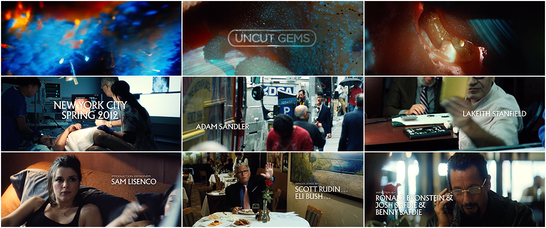
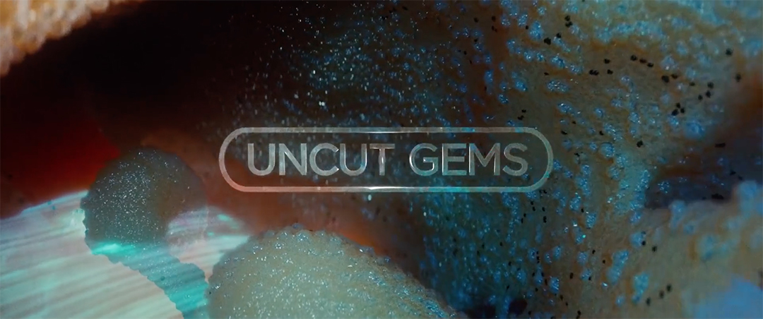
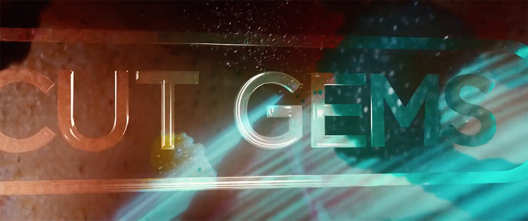
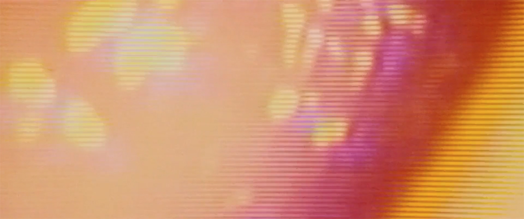
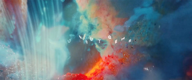
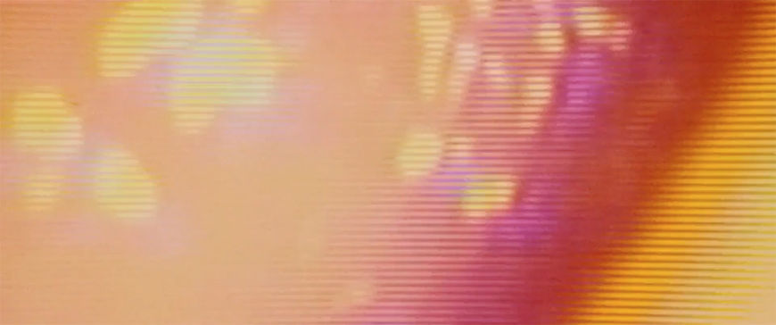
But the film's story really begins with an emergency at a mine in Ethiopia. After an injured worker is carried away, two others uncover a large hunk of opal. They whisper to each other, mesmerized by its beauty and power, as the camera comes ever closer until it penetrates the gem, sliding through its solid mass into a psychedelic dream of shifting colours and nebulous shapes created by visual effects studio Brainstorm Digital. Beams of light pierce vibrant blue walls and red mists and the letters of “Uncut Gems” fly in, translucent as glass, forming the film’s title. The title typography, created by industry veteran Randy Balsmeyer’s Big Film Design, is encased in a tight rounded box that gleams before gliding out of view. The camera spins as we travel ever deeper, the walls taking on a warm, fleshy hue. Drops of moisture line the surfaces as we plunge into what is now clearly something alive, something human. We are expelled from Howard’s colon through a digital screen and then dumped into his mess of erratic deals and dizzying errands.
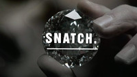
“I almost had a panic attack in the office but I really loved it,” said Hassan Rahim, designer of the film’s credits typography, when he saw the opening scene, echoing many viewers' reactions. With nods to The Exorcist, Snatch, and the films of John Carpenter, Robert Altman, and Charles and Ray Eames, the opening is a whirlwind of influences and energy, overlapping dialogue and vibrant characters.
And the effect of all of this? Well, it’s a bit of a rush.
A discussion with Uncut Gems co-director JOSH SAFDIE, with insight from Visual Effects Supervisor ERAN DINUR of Brainstorm, Title Designer RANDY BALSMEYER, and Designer HASSAN RAHIM.
Hi Josh, thanks so much for your time. When I first saw Uncut Gems in theatres, I immediately had so many questions for you, so this is a treat.
Josh Safdie: Thank you for your interest! I was just explaining to my producer that I’ve been a very big fan of this website for a long time so it’s an honour to be included. I find the art of the title [laughs], no pun intended, to be the most subversive art form because it’s one of the most supernatural parts of filmmaking. It conveys tone subconsciously and it also allows the filmmaker to do things counter to experiential normities, for example – I’m sorry, I’m jumping right into it but it’s important for me to say this!
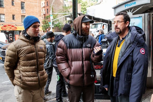
Benny Safdie, Josh Safdie and Adam Sandler on the set of Uncut Gems.
Photo by Julieta Cervantes/A24
Of course, go on.
JS: A title sequence conveys a certain message: a tone – and it’s usually a disposable tone. This is the opening credits, we’re easing you into the story. What you’re seeing is usually very economically plotted in terms of the storytelling or it’s potentially disposable information that helps set the tone for the movie.
So what we like to do is use the title sequence as a pragmatic or economical disguise to cram in exposition. Because exposition is the worst. Anyway, that’s why I love title design.
You know, I wanted to be an architect as a kid, and then I wanted to be a graphic designer because my dad was dating a graphic designer and she had this really cool apartment. And then I went to film and I feel like film is the amalgamation of all the arts. You have architecture included, you have graphic design included... That’s my preamble!
That’s a perfect segue and it does seem very clear from your films that you’re a big fan of graphic design and of title sequences.
JS: Oh, yeah, yeah, yeah! With Good Time, I worked with Tom Kan, who you guys have done a few things with.
Good Time (2017) main title reveal, designed by Tom Kan
JS: His Enter the Void sequence is amazing. Gaspar Noé is an incredible visual artist. And the opening credit sequence for Enter the Void is certainly a top ten opening credit sequence. So I worked with Tom on Good Time and I really liked working with Tom but I wanted to work with someone new for Uncut Gems. I knew we were gonna be doing it in the interior of the opal. I wanted something garish – ’cause the world is very garish – but at the same time I wanted it to have a gargantuan feeling to it.
We talked with a few designers before we ended up picking Randy Balsmeyer. Like, the fact that Randy’s company is called Big Film Design [laughs], that was perfect. I wanted to work with someone who would bring a certain classic quality to it. Classicism is part of it. Randy is now one of the classic film title designers. It was interesting to see Randy’s instincts and how he would usher in a letter or a transition. He just had a very different point of view than I do which is what I was looking for. I thought it would be very interesting to collaborate with somebody like that, whereas Tom is more at the forefront of the new style of title design.
Randy, can you speak a bit about your work on this project and your references going in?
Randy Balsmeyer: It’s unusual for me to just do a title, usually it’s the whole sequence. Josh would send me emails with movie titles or ads or things that he liked. He was looking for inspiration to send to me, to inspire me. They were all over the place. Let me see what I can dig up… Oh, this is all in one email early on. Heavy Metal. Das Boot. Body Heat. Serpico. Dead Poets Society. Empire of the Sun. The King of Comedy.
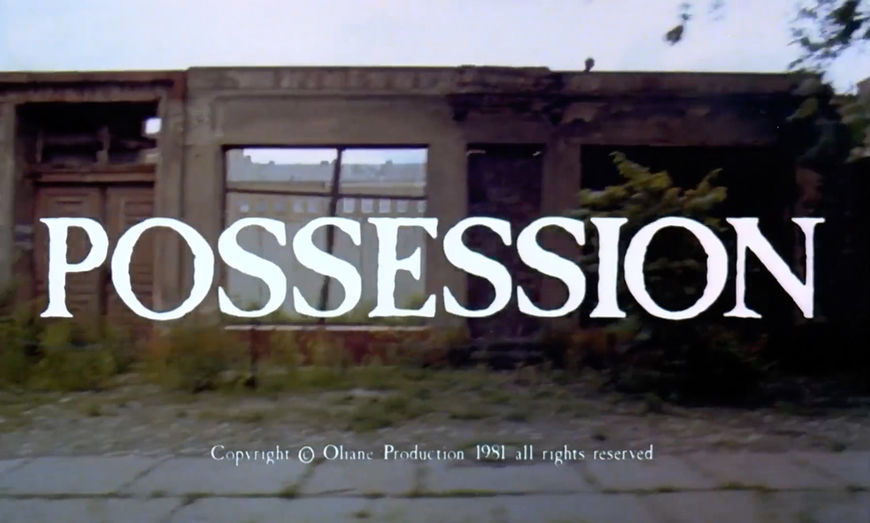
Possession (1981) main titles
RB: One that we looked at initially was Possession, which has like a Caslon Antique kind of typography which didn’t seem to me at all to fit the movie. We went through a whole series of layouts of Uncut Gems in eroded antique lettering and Josh realized that didn’t work.
What I envisioned was glass shards – that the title would somehow be an implosion of glass, of reflective stuff, to go with the idea of gems and facets. Verbally Josh liked that a lot. My first pass at it, I used a stencil sort of font where all of the segments of the letters are separate pieces. I thought, Alright, this is it, it makes sense, it works with the facets idea. And he hated it. So then we were back to square one and went through, I don’t know, 50 different fonts and styles.
That many?
RB: It was a lot! If anything, we went through the 50 versions because he is very hands-on. It’s not just “Show me something I like!” Then we had this discussion about the frame around the lettering. We finally got that resolved but then there was the motion to deal with. I kept doing a pass, and he’d have notes, and we’d do another pass. I know it seems simple because it’s five or six seconds but it’s all 3D and so every render was four or five hours to turn around. It was just me and Emmett Goodman. We weren’t quite making him happy, so finally he says, “Could I just come by your office?” And he did and it worked great because it was all about – how should I put it? – the letter. How it would steer around and anticipate a curve. We could do that in realtime on the workstation, so in a two-hour session with Josh we worked that out. Emmet polished up the glass look, getting the glass render to work.


Can you talk a bit about this idea of class? Graphic design in film is often used to place a picture into a specific echelon.
Josh Safdie: Totally. I believe that the micro is in the macro and vice versa. I think that’s been proven physically. I mean, when you look at the formation of the cosmos and the formation of an atom, they’re almost identical. So that’s been kind of proven. Charles and Ray Eames illustrated that beautifully in their film The Powers of Ten. I have to give credit to Charles and Ray Eames for that film because it does put things into focus.
At the heart of a capitalist world like the one we all live in, but in particular consumerism and materialism, you have the material.
Powers of Ten (1977) short film created by Charles and Ray Eames
JS: I think that it’s important to bookend and earmark this movie as a very human film. It’s about a flawed character who we very warmly tell the story of but I understand that he might rub people the wrong way. He ends up winning you over in spite of his flaws, which is, again, a very uniquely human trait. We show the vast nothingness that exists in contrast to the maximalist nature of a garish human wrapped up in capitalism like Howard. You can only see his purpose in contrast to the emptiness of the universe. At the heart of a capitalist world like the one we all live in, but in particular consumerism and materialism, you have the material. The material is what binds us to the beginning of time.
Howard says you can see history, you can see the universe if you look into an opal because it has such a mercurial shapeshifting appeal.
VIDEO: Sequence from Uncut Gems featuring Kevin Garnett peering into the gem
JS: At the centre of this story is this thing that is a capsule of humans – of Earth. Howard says you can see history, you can see the universe if you look into an opal because it has such a mercurial shapeshifting appeal. To travel through this gem is almost like travelling through time–space; the cosmic nature of the film lies in the fact that in one instance, on one side of the planet, you have someone worried for their life, worrying about a machine falling on their leg and killing them or giving them a disease or crushing them, that’s his worry, his microsecond worry of the fatality of his life. On the other side of the planet at the exact same moment, the microsecond worry of a jeweler on 47th Street is whether a professional basketball player is going to hit a free throw, and having that constant juxtaposition is what makes the film cosmic. This stuff connects them.
The journey into the gem
JS: When I was working with Brainstorm, I told them I wanted to enter the opal. When they read that in the script – that it’s slowly transformed and glistens and pulsates to the movements of a colon – they were baffled because a lot of visual effects artists really work by mandate of imitation, you know? They do what you tell them to do with reference. The problem is that there’s no precedent for the interior of a gemstone, it just doesn’t exist. You can’t film that.
Eran, how did the conversation start about creating the journey into the gem?
Eran Dinur: It was clear from my first discussions with [Josh and Benny] that we’ll have to build the entire gem world in CG, because obviously there’s no footage we can use. The hard part was figuring out what it looks like inside. Josh felt like it should feel both microscopic, we went tiny into a gem, but also giant, like cosmic – a combination. Eventually what opened our eyes was the gem photography, there’s some amazing stuff that was done using microscope and cameras. We were stunned by the beauty of these photographs. We started building three dimensional worlds – or we call them “rooms” – inspired by this.
Josh Safdie: I would send them references from NASA of supernovae and then I would send them real-life colonoscopies and say, we have to get from here to here.
There was an artist, Eduard Gübelin, from the ’50s who basically pioneered photomicrography and he was interested in photographing the insides of gemstones.
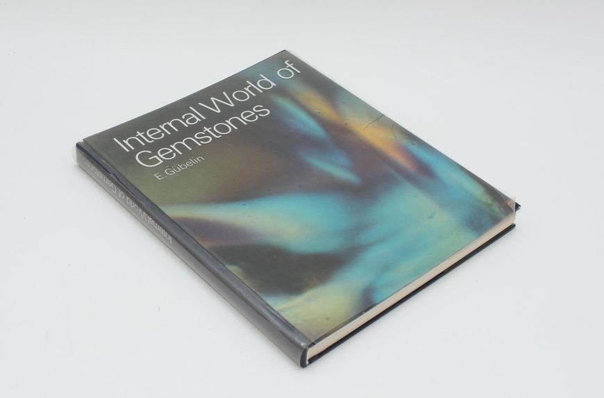
Internal World of Gemstones book by Eduard Gübelin
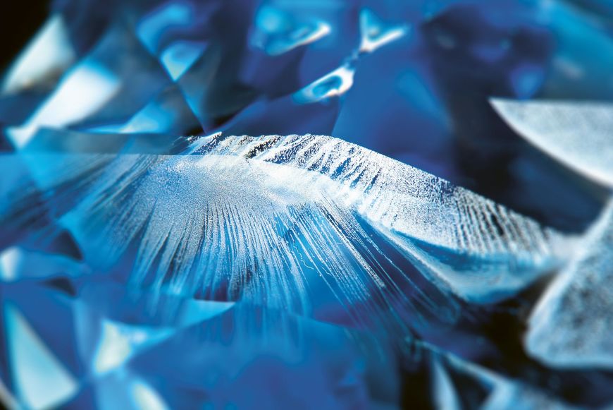
Sapphire inclusion photomicrograph by Eduard Gübelin
JS: The technology then was limiting – the images are really beautiful, I actually prefer them to the modern stuff – but his books were discovered by an artist in California named Danny J. Sanchez. We communicated with him via email briefly when we were going to try to do this physically. Through the use of bracketing photography, he photographed the interior, in particular, of opals, and his photographs were very helpful in unlodging how we were gonna see this inside of an opal.
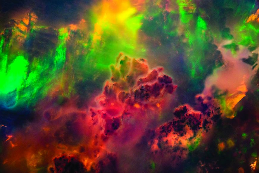
Photomicrography of an opal by Danny J. Sanchez
Sanchez does really amazing work. What he does is incrementally, slowly sweep the focus, and then combine these photos to create a wider depth of field,
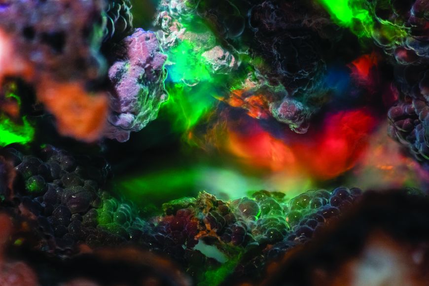
Photomicrography of an opal by Danny J. Sanchez
Eran, can you talk about the photomicrography references from Danny Sanchez and how you achieved the look of the inside of the opal?
Eran Dinur: Sanchez does really amazing work. One of the problems with shooting through a microscope is that your depth of field is very small, so whatever you focus on, everything else is out of focus; you can’t get a sense of any depth. What he does is incrementally, slowly sweep the focus, and then combine these photos to create a wider depth of field, so you can actually see the world, otherwise it feels very two-dimensional.
ED: We did it the other way around, so we had to narrow the virtual camera’s depth of field to get that sense that only a small area is in focus at any given moment and that also gives it a sort of microscopic feel. Our camera was moving through, which, of course, Danny Sanchez or anyone shooting with a microscope can’t really do – you can’t move a camera through a gem. We never tried to make it scientifically correct, the idea is that we are inside the gem, but we are also inside Howard's mind. It was an imaginary landscape. It was more about what looks good and we created different types of "rooms", or environments.
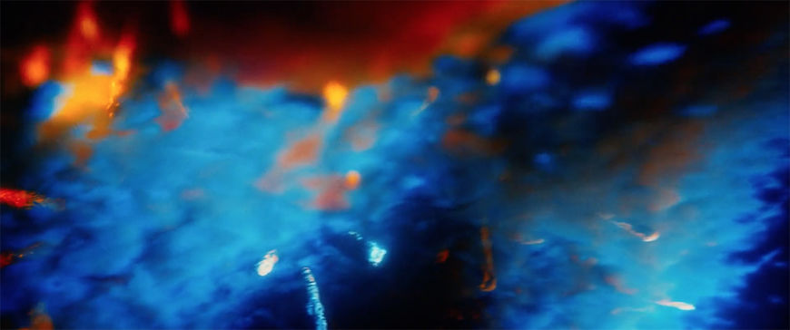
Still from the Uncut Gems opening "journey into the gem" VFX sequence
ED: We also looked at cosmic images of nebulae, for the other side. We came up with those structures that look a little bit like corals. I always liked them and I thought they worked really well as we travel through them. Josh at one point said they feel too aquatic. So we changed the colours – because what gives something a sense of underwater is, as you go deeper underwater, some of the wavelengths of light start disappearing and usually the shorter wavelengths – red and orange and yellow – disappear first, so anything with strong blue and green hues feels like underwater. So we just reverse the colours. That kind of negates the underwater feeling, makes it feel like a different world.
We ended up finding a very clean colonoscopy in the — [bursts out laughing] — in the video library. I really liked the way that the camera inspected this particular colon!
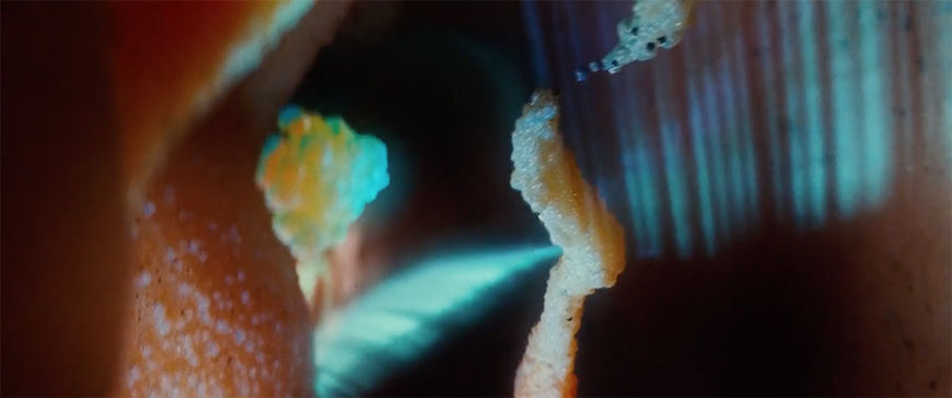
'Transitions into a colon'
Now I will ask what is probably one of the weirdest questions I’m ever going to ask: Whose colon is that? Where did that footage come from?
JS: [laughs] There was a library of colonoscopies. There are video libraries that you can pull from, like for art direction companies and VFX visual aid companies for film and theatre, where they have like, royalty-free – it’s funny to say that because this is a colon, you could never lay claim that it’s your colon – but… well, the problem became... some colonoscopies where the colon wasn’t properly cleaned are really hard to look at.
[laughs]
JS: They’re just disgusting! [laughs] And I knew that you come up with an idea – “Transitions into a colon” – and it reads a certain way. Your brain would not add the disgusting nature of what an actual colonoscopy would look like. I always knew that was going to be a hurdle [visually]. We ended up finding a very clean colonoscopy in the – [bursts out laughing] – in the video library. I really liked the way that the camera inspected this particular colon! And for a while we were talking about building the colonoscopy entirely in VFX but there was something to this particular colon [laughs] that I really responded to and then once I did, I could never abandon it! [laughs] It’s tough!
We had the lightbulb idea of allowing the quote-unquote camera to crash into one of the fleshy walls and once it crashed into the walls we could hide our cut to a real-life colonoscopy.
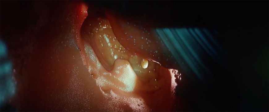
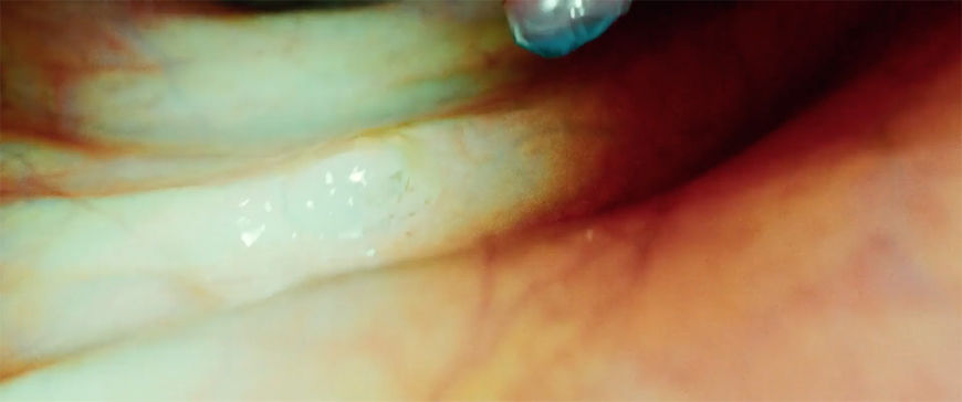
JS: They did build a real colon – digital colon – and they did a beautiful job. We had to – like everything in our movie – increase the lens length on all of our movements to give it a slightly realistic feel because even though colonoscopies are done with a fish-eye camera the longer lens helped, for some reason, to obfuscate the digital nature of it. Then we had the lightbulb idea of allowing the quote-unquote camera to crash into one of the fleshy walls and once it crashed into the walls we could hide our cut to a real-life colonoscopy.
Eran, how did you achieve the look of the colon? That specific fleshy, wet look?
Eran Dinur: [laughs] First of all, we waited a while for the footage of the colon. Through our own CG we transitioned into a real colonoscopy footage, and then we pull out of it and we project that on the monitor of the doctor. The look was achieved mainly by playing with the shaders. The shader is what controls how the material looks so we had these “rooms” – the tunnel or the cave – that the camera went through and we start gradually changing the shader, so the specular reflection becomes very strong so it looks wet and slimy. It was experimenting a bit.
Also we use different lights along the way to light it like you do in one of those caves where they put lighting to highlight the shapes, but when we wanted to give it more of a colonoscopy feel we actually switched to almost like a spotlight, because that’s how it works in reality. They have a little camera that they push through and that camera has a little light, almost like a car headlight. So the combination of creating a shader with high specularity, what we call “code,” which makes it feel wet and reflective, and also switching the light to a frontal, strong light, and we kept going back to the real footage to get that sense. We also at some point start degrading the quality of our renders so we can transition to the footage, which is much lower quality.
The Maximalist
How much is Robert Altman an influence for you, title design-wise but also sound design-wise?
Josh Safdie: He’s always an inspiration. Altman was a vanguard and a pioneer of really modern filmmaking. The freedom that he gave his actors is always inspiring. In particular his approach to sound was revolutionary. He’s a maximalist filmmaker and I’ve always responded to that in his work. He knows that if you were to follow somebody in reality and experience their narrative, watching them, there’s a lot you wouldn’t pick up on – nuances of slang and nuances of that person’s life – and actually you wouldn’t hear everything. Altman was kind of the first narrative filmmaker to technically say, It doesn’t matter what they’re saying here. A lot of studios didn’t like that because they don’t want the audience ever leaning in to hear something.
Altman would create such dense characters that were so alive, that you didn’t need to hear everything.
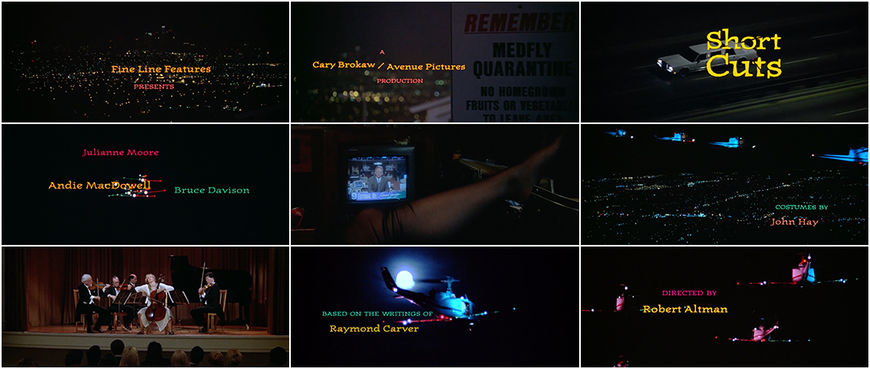
Short Cuts (1993) main titles, designed by Balsmeyer & Everett, Inc.
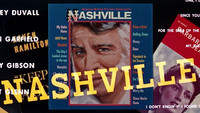
JS: Altman would create such dense characters that were so alive, that you didn’t need to hear everything. Obviously in a film like McCabe and Mrs. Miller or Short Cuts or The Long Goodbye or California Split, Nashville, Brewster McCloud… I mean, 3 Women! He’s done a lot of masterpieces – but he had this kind of ensemble quality to his work, too. You got the sense that it was filled with life.
In Short Cuts, in particular with his title design, it’s very memorable. It was early for such conceptual photography. The fact that Randy did the design for that film just speaks to his own personal history.
Some sort of cursed history
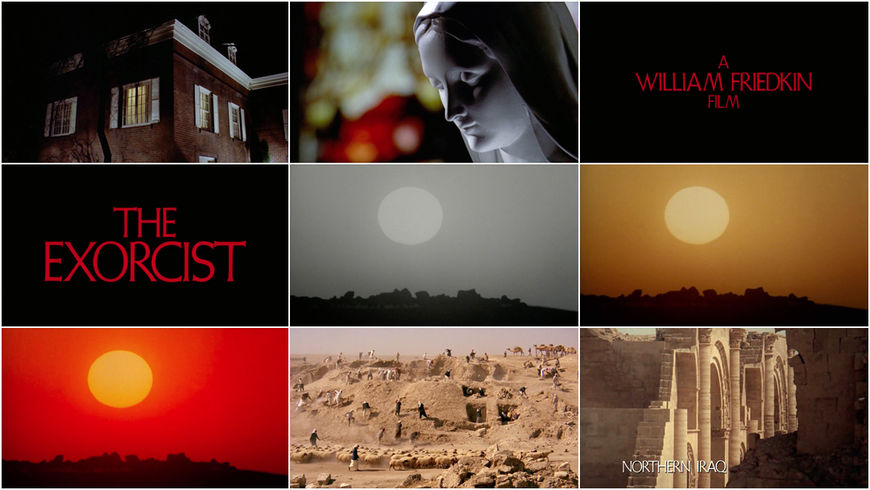
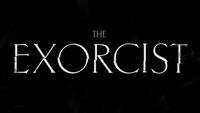
The opening sequence also has some horror-related elements. It’s got this Exorcist-style opening—
JS: Well, Friedkin is another one! I mean, that’s like the concept of a talisman-type thing. There was this thing behind the scenes often with us, when we were writing, I would often say, “Don’t forget, the main character of this movie is a 600-carat opal.” I would say it jokingly, but the reality is that the day that they find that opal is not a good day at the mine, you know? [laughs]
The Exorcist (1973) main titles, designed by Dan Perri
JS: The opal brings a lot of riches to people’s lives but it also brings a lot of tragedy. Trying not to hit these things too far on the head but there is a horror element to that all.
The horror element also comes in with the typography.
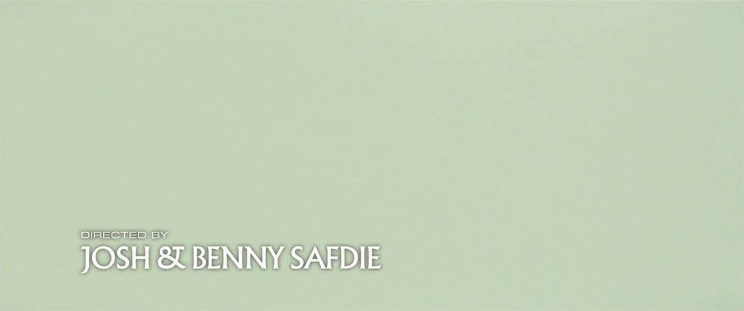
JS: Yes! Hassan Rahim is who did our titles beyond the actual title card. He is a very talented graphic designer. I have a typography book and it’s about a thousand pages and it has a library of physically printed types. Very early on, I really wanted to use Albertus. With Hassan, we picked that.
I wanted to use a type that evoked a history — or evoked some sort of cursed history.
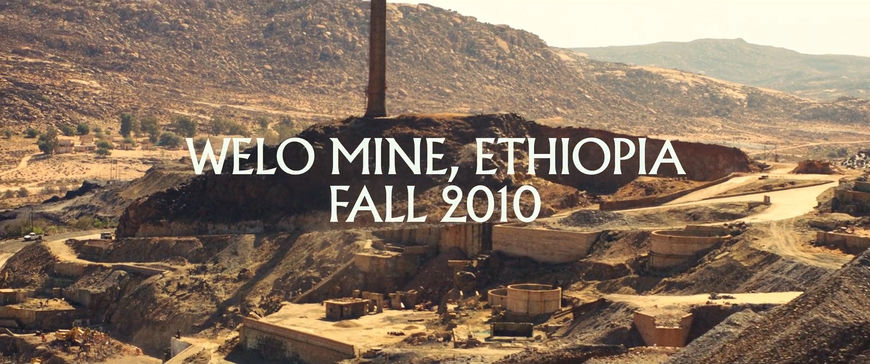
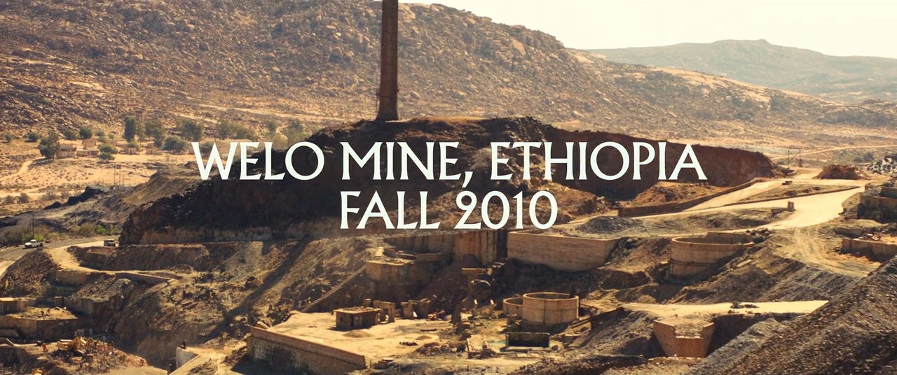
Welo Mine, Ethiopia; Fall 2010 – locator/date card

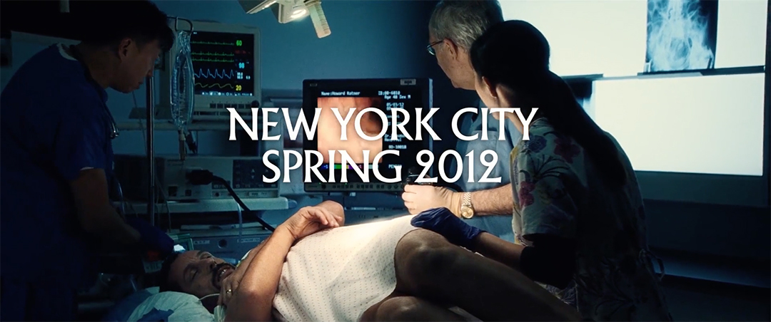
New York City; Spring 2012 – locator/date card
JS: Going back to the ancient quality of gemstones, I wanted to use a type that evoked a history – or evoked some sort of cursed history. Albertus was the first type that came to my mind, and then you think, Well, why did that come to my mind? As someone born in 1984, it was probably because somewhere deep down inside I knew that John Carpenter used Albertus! [laughs] So finding our own Albertus – in this book there’s probably 100 different varieties of it – we found the one in particular that had a very interesting ampersand.
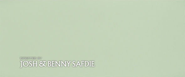
JS: The big conversation with Hassan became the juxtaposition between the credit font and the main font. It was a very futuristic one – or, futuristic as the future was seen in the ’80s or ’90s. The juxtaposition between that font and the Albertus below it is like this brand new with this very old underneath it, which is the jewellery business! You have this modern modification of these ancient metals and stones. We wanted this feel of the new with the old throughout.
Hassan, what’s your process around type, and how did you create the credits for Uncut Gems?
Hassan Rahim: My process around type is I stick to the classics – it’s really simple. All the typefaces I use are usually from the ’20s through the ’70s, that’s pretty much it. There’s not a typeface in the last 20 years that I can’t live without.
So we picked Albertus and we picked a very specific cut of Albertus with some custom features to it. The reason I guess there’s a horror element to these titles, and why you’ll see Albertus across so many of these things, is the typography books that were made available before computers. I didn’t really think about it, like, “This typeface feels horror and this one feels—” I just look at the contrast. That was the point – visually there’s a contrast between an extended sans and Albertus. It’s like complementary colours – why does green go with purple? It feels like an intuition to me.
Which version of Albertus is it and what’s the extended sans you used?
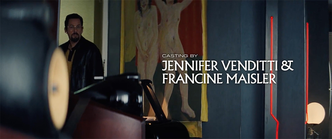
HR: We used Albertus Nova for the names and Pilat Extended for the rest. It’s a really thin wide sans serif – an extended sans serif. I really like Eurostile. Eurostile is a typeface that’s a classic – used across everything, it just doesn’t get old – but I wanted to find something a bit wider and thinner so I found this typeface, Pilat. The whole idea was: iconic. That’s where I wanted to stick. I think this film is extremely contemporary but there’s a nuance to how contemporary it is. It takes place in a very specific time – it’s 2012. But I wanted to make it classic and a bit more timeless. I thought it would be cool to not pinpoint it to any specific point in time typographically.

Still from the Uncut Gems opening featuring the "Casting by" credit
From 47th Street to the stars
For the ending sequence, after the final scene, we travel back into Howard’s body through the bullet hole. How did you approach this?
Eran Dinur: The actual travel through the gem was already set, actually the one at the end is longer and has more of that coral that I told you about before. We worked on both [the opening and closing] pieces at the same time. The really hard part was doing Sandler, because we shot him without any blood at all. That was my decision, basically.
He also moved quite a lot because it was very hard for him to lay still, especially when the camera gets so close – it’s almost impossible. It’s such a long push-in of the camera that we also had to still him completely in CGI. We created all the blood and the bullet hole in CG as if it was matte painting, which was hard because we get so close to his skin that, you know, usually when you do visual effects and you do blood effects you never get so close to the person. The amount of detail we had to get there was huge. We also had to play with focus to make it feel right, because obviously the real camera couldn’t get that close. We had to extend the movement further until we go through that hole. Josh wanted it to feel a little ambiguous, so the viewer doesn’t really know what they’re seeing, so we used volumetric renders, but very dark red, so you feel like you’re going through something very dark and you get a sense of something red around you but it’s not very clear until we join the interior of the gem.
"Journey Through the Gem" 360º behind-the-scenes featurette by Brainstorm Digital
Did you consider doing any of it practically, with blood on set?
ED: To be honest, at some point, I wished we had something practical there. But I felt we may end up with something that’s not going to be good enough or will not work well when we zoom in closely. So the decision was to shoot him completely without anything. Generally I think that it was right. At a very late stage, when we get really close to the bullet hole, they wanted one last blood spurt, and that’s where the decision to do it virtually rather than on set proved right because this was not something that could be done practically then. There was no way to create a practical rig on an actor’s face where blood will come out of a tiny hole when the camera is very close. That helped us. We created a liquid simulation to have a bit of blood pouring out at the last moment, so the combination of this and playing with the focus to give a sense that everything is alive.
How do you know what’s realistic? If you, I hope, haven’t been around people getting shot, is this a matter of replicating what’s seen in movies or is there reference you pull from?
ED: Yeah, it’s not like you have tons of reference, thankfully, and it’s not fun to look at reference. We do that for any kind of visual effects that we do and unfortunately when you look for blood and gore you end up looking at horrific images online. Josh and Benny had these really weird videos, kind of underground, people shooting themselves in the leg, or things like that? He was happy to send it to us! Like, Guys, look what I found! [laughs] Personally, I don’t enjoy this very much but it’s necessary. Even with that, there is almost no footage that looks so close at this kind of thing, so you take a bit of liberty to decide how it will look but you can tell when it feels realistic just by looking at it.
A real romanticism
After the movie’s finale, we travel through Howard and into the cosmos and then we’re hit with that upbeat song by Gigi D’Agostino. Tell me about that song – it's an interesting choice.
Josh Safdie: Aw man, so the only lasting ideas that started in 2009 and showed up in the final product of the film were Howard’s death – he always died at the end though the way he died changed a couple of times – and this end credits song by Gigi D’Agostino, in particular the Small Mix. There’s probably 30 different versions of that song, including an orchestral interpretation [laughs]. There’s a real romanticism in that song. We wanted to do an almost Altman-style use of it. The lyrics always felt like a devotee singing to Howard Ratner, like we’re gonna be clubbing in his name.
Uncut Gems (2019) end VFX shot and closing credits featuring the song “L’Amour Toujours” by Gigi D’Agostino
JS: It just became the anthem of the movie over the years and then somehow, within the last 18 months of finishing the film we abandoned the song! It wasn’t even a thought to use it. We were going to use an original song that The Weeknd wrote for the movie with Oneohtrix Point Never. Then we actually finished the film, and that music, we knew, was going to come to an end and it just dawned on me and Benny. We were like, “Why have we been ignoring this song for so long?” When you’re actually in the vibe of the ending of the movie, your mind doesn’t go to Gigi right away! [laughs]
Once we put it in there, it was like, “This song was always meant to be tied to Howard.” It was kind of triumphant; it made his death celebratory. You’re celebrating his life as opposed to mourning it, which I thought was cool, after dumping you out into the universe.
That product feeling
Okay, one last question. For Daddy Longlegs, Heaven Knows What, and Good Time your title cards include a copyright line at the bottom.
JS: [laughs] Yeah, yeah!
How did you start using that and why did you forego it on Gems?
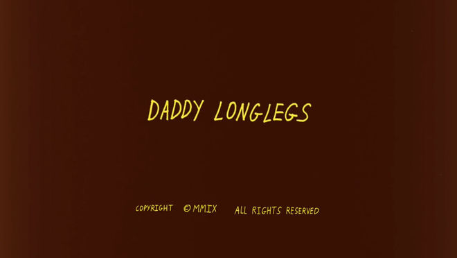
JS: I started doing the copyrighting on the short films. For Daddy Longlegs, I did all of the lettering for the opening credit sequence there. Our films used to all be my handwriting. My handwriting kind of naturally looks like Pablo Ferro’s handwriting so I would just accentuate it. The letters were kind of long.
Daddy Longlegs (2010) main titles, designed by Josh Safdie
JS: I started doing it because all the films that I loved did it. It felt like this kind of commercialist stamp on the film. Like, this is done and this is copyrighted information and don’t you dare try to steal it! I liked that product feeling. I like when a piece of art, a very personal piece of art becomes a product. Copyright. And on Gems, I don’t know why... I guess you could say I grew up a little bit? [laughs]
I also started to see that everyone was putting it in. Not that we were the first but I started to see it a lot more. It was starting to feel vintage. It also would’ve been weird because the title card of Gems is such a thing, it’s so immersed in the journey. I believe the letters exist inside of the gem.
There’s a legal reason why they originally existed and then there was an aesthetic reason why they stopped existing. With minimalism, you want to strip away because it makes things feel more modern, so people started getting rid of them. Certainly cinephilic directors are the people who brought it back because they were nostalgic for it.
Lastly, anything I haven’t asked that you want to mention?
JS: To be honest, this is the first interview in regards to Uncut Gems that I’ve done in a while now. I stopped doing them entirely because it’s not healthy to talk about yourself and your work so much. I only wanted to do this one! Because I love Art of the Title so much. Thank you for doing this.
Thank you!

