A pigeon and a unicorn walk into a convenience store in the opening scene of Dan Berk and Robert Olsen’s 2019 darkly comedic thriller Villains. Mickey (Bill Skarsgård) and Jules (Maika Monroe) are a duo of small-time robbers who get more than they bargained for after breaking into a quiet house in the suburbs. What follows is anything but quiet as the film twists and turns and the couple find their wits outmatched by the home’s demented owners.
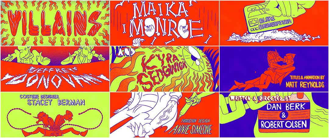
For its final surprise, the film closes with a boisterous explosion of colour and cartoons by animator Matt Reynolds. Hand-drawn bones, guts, masks and mouths collide and contort, telling the story of the film in writhing shapes of red, neon green, indigo and white. Drawing on influences ranging from Badlands (1973) to Honey, I Shrunk the Kids (1989) to Beavis and Butt-Head Do America (1996), the stunning closing sequence to Villains is a joyful celebration of the film and an ode to the blood, sweat and tears that went into its creation.
A discussion with Villains directors DAN BERK and ROBERT OLSEN and title sequence animator MATT REYNOLDS.
Matt, tell me a little about yourself. Did you study animation somewhere? What's your background?
Matt Reynolds: I came to animation from filmmaking after being exposed to the work of Jan Švankmajer and other surreal Eastern European animators during a semester abroad at the FAMU film school in Prague. I tried my hand at a couple unnecessarily tedious self-taught methods of stop-motion before taking a Flash animation course at the Northwest Film Center while working as a barista in Portland, Oregon. Then I decided to get “serious” about animation and entered the Experimental Animation program at CalArts.
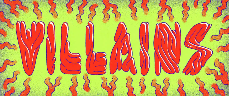
Villains (2019) end title card
Is this your first title sequence project? How did it come to you?
MR: Yeah, this is the first one but hopefully not the last! Producer Chadd Harbold had seen the film bumpers I did for SXSW in 2017 and recommended my work to Dan Berk and Robert Olsen who were looking for something wild and psychedelic. My stuff seemed to fit that criteria.
Set of three bumper videos created for SXSW 2017
ANIMATION & DESIGN: Matt Reynolds
SOUND DESIGN: Daniel Eaton
COLOR ASSISTANCE: Maureen Kuo
ADDITIONAL MUSIC: Elijah Ocean
Robert and Dan, did you always know that you wanted a special sort of title sequence for your film?
Robert Olsen: Yeah, we had talked about it a lot. We had intended for it to be at the beginning of the film but it wound up kicking too much ass! [laughs] It was so energetic and full of life and so crazy that it made the film that came after it feel less so, so we wound up putting it at the end. So you watch the whole movie and then you get this fun wrap-up sequence that leaves you with a buoyant, fun feeling.
Dan Berk: The sequence was written into the script from some of the earliest drafts. It was the second scene in the script. It was its own scene. You had the gas station robbery and then that crashed into the title sequence and it was written in, like, “kinetic psychedelic title sequence”. It was very important to us that we did that. We’re fans of title sequences in general. We love what they do to put you in the right headspace.

Body (2015) movie poster
When I saw the poster for your 2015 film Body, it seemed obvious that you’re fans of titles and graphic design.
DB: Definitely. It’s super Saul Bass-y. I’m standing in front of that poster right now in my office. We love that graphic style and that worked for that film because we intended for there to be a bit of a Hitchcock flavour. I remember we both saw In A Valley of Violence at SXSW, which has an absolutely gorgeous title sequence. We were working on a draft of Villains at that point. That title sequence was kind of knocking around in our heads and—
RO: And I think it was that same South By where Matt had done all the bumpers – these short animated sequences before each presentation – in his irreverent style. That’s where we became aware of Matt’s talent and then we watched every short of his. Hot Dog Hands was one we loved.
Hot Dog Hands (2016) by Matt Reynolds
MUSIC: Libythth
SOUND MIX: Aidan Reynolds
VOICE of HOT DOG HANDS: Gillian Wallace Horvat
DB: Yeah, Hot Dog Hands and Bottomfeeders… He’s got a bunch of shorts that are just so inventive and gross in the most visceral way. It felt so perfect. He deserves the absolute gigantic share of the credit for this sequence in both conception and execution. He put together a lookbook for us that was like this whole plotted out narrative. We gave him essentially the direction that Bobby started with – the peyote sequence from Beavis and Butt-Head and a few other references.
Taking cues from Beavis and Butt-Head
MR: Dan and Robert were using the hallucination scene from Beavis and Butt-Head Do America as a reference for the energy they were hoping for with the title sequence.
Hallucination scene from Beavis and Butt-Head Do America (1996)
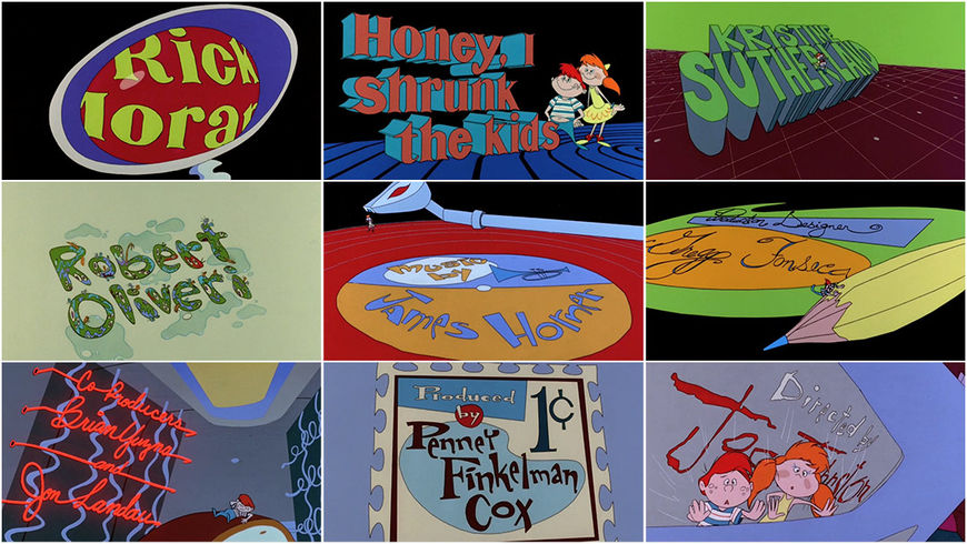
DB: That Beavis and Butt-Head sequence is pretty grotesque. The creatures and humanoids in it are really disgusting-looking whereas ours wound up a little more cutesy and there are masks involved. We wanted a mash-up in feeling like the tripping-in-the-desert sequence from Beavis and Butt-Head but mixed with the title sequence from Honey, I Shrunk the Kids. I think it’s one of the best. The sense of scale. How playful it is. What a good job it does setting up the tone of that movie. How bold it feels. And that incredible score. That was a huge influence in playing with scale, where the figures feel like a normal size but then it zooms out and there’s something much larger.
Honey, I Shrunk the Kids (1989) main titles created by Kroyer Films, Inc.
MR: I read the script and they explained they were going for a high-energy thriller/horror that’s also kind of a dark comedy. So I was like, “Oh, you want like cartoon bodies being ripped apart and stuff like that, yeah?”
DB: We were just like, “Dude, fuck yeah. Go ahead.” Matt brought that to life with all of these different ideas and how all the characters could interact with their environment, playing with scale in eye-opening ways.

Sketch of character designs for Villains title sequence by Matt Reynolds
RO: We gave him very little direction. We were not saying to him, like, “And then they should crunch the bones and then...” We told him the loosest terms and the general animation style and that the characters should, you know, engage in activities that were vaguely representative of events in the movie.
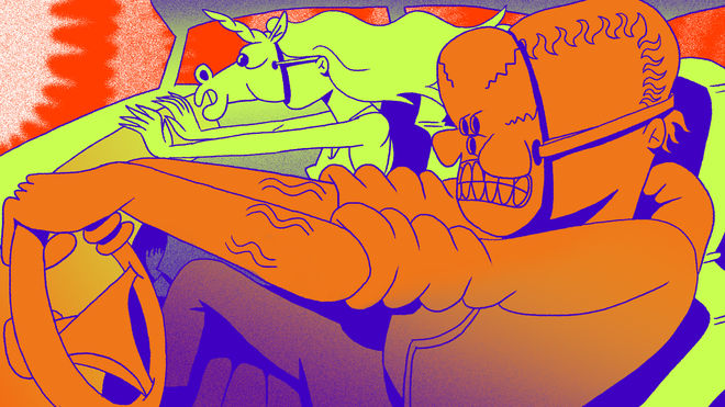
Early style and color sketch for Villains title sequence by Matt Reynolds
MR: I showed the guys some work by a favourite contemporary animator of mine, Sawako Kabuki, because I felt like her use of transitions and plastic bodies matched the energy they were hoping for. Then I took a few key events from their script and made my own script of possible transitions using Bill Skarsgard and Maika Monroe’s masked burglar personas in the first scene of the film as the central characters of the title sequence. Pretty much everything from that first script made it into the title sequence.
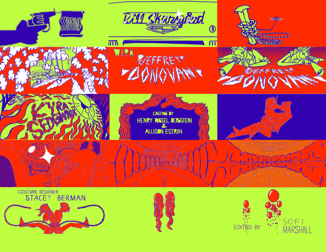
Color script by Matt Reynolds for Villains title sequence
Lost in Space
MR: Dan and Bobby also originally wanted me to make a couple other animated sequences for the film. There was a whole sequence that I animated of things flying around in outer space after one of the characters gets knocked unconscious but it ended up getting cut. Josh Shaffner really helped with that outer space sequence.
DB: On paper, we had the title sequence that was going to be in this notable animated style at the top of the film and then, after Mickey gets knocked out, we had an animated sequence in space, with comets flying by and this foggy George and Gloria conversation. It zooms through the clouds and the roof of the house and ends up with Mickey chained on the bed. Matt created that for us but ultimately the tone of this film is such a narrow bullseye so throughout the edit we were doing everything we could to stay on this tightrope and nudge more tension in or nudge some levity in. What we ended up needing was not a moment of levity there but a moment of darkness. We found that we could repurpose some 8mm footage to create this dark, imagined moment with Jules and Sweetiepie in it. We had to get rid of this beautiful animated piece that Matt made. One of those classic kill-your-darlings moments.
—Dan BerkThere’s such a magic to title sequences that are really visually adventurous. People just get so excited about them.
RO: There is a line that you cross when your film jumps into an animated sequence within the narrative. If you do a title sequence at the beginning or an end credits sequence, that's one thing but as soon as you have an animated sequence within the body of your film, it can kind of jump the shark. You can overdo it.
DB: There was a third animated sequence that was going to exist around this laundry chute that Jules was climbing up, in that same style of the title sequence and the Mickey knock-out sequence. It was the same exact decision about the other piece. It was silly enough, or straining credulity enough, that Jules was climbing up this laundry chute, that to then add an animated element would spin it off. We needed to ground ourselves. Those were tough decisions! Matt worked really hard on those but the film demanded something else in those moments.
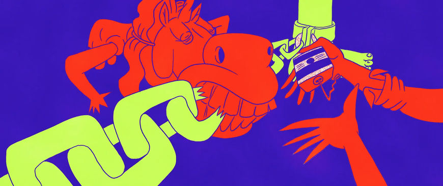
Still from the Villains end title sequence by Matt Reynolds
Matt, tell me about your team – the animators that you worked with. How did you come to work together?
MR: I got help from a couple amazing animators I met through CalArts. Kevin Eskew, Danski Tang and Dian Liang are all outstanding filmmakers but this was one of those instances where I was only really asking for a couple rough or cleaned up frames timed to my working animatic. Dian helped me a bunch with my student film Hot Dog Hands and I feel like I’ll always turn to her first if I need help on a film.
Which tools and software did you use to put it all together?
MR: It was a real Adobe CC carnival: rough animation done in Flash, cleaned up frames and colour in Photoshop and compositing/editing in After Effects and Premiere. Now hook me up with a discount, Adobe!
DB: Like, we didn’t finish the movie and then he started the title sequence. We’re probably just going completely off of your questioning here but now I’m just excited to talk about it. We hired Matt long before we shot, so when we were on set we were getting emails from him with options. Halfway through the shoot we got a full animatic. Bobby and I were going crazy looking at it on our phones and showing the producers. We were able to show the actors the weird shit that their names would show up on.
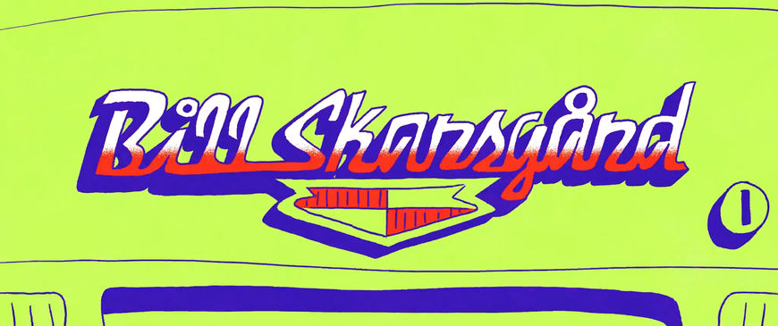
Still from the Villains sequence showing the credit for Bill Skarsgård
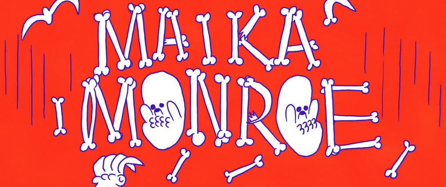
Still from the Villains sequence showing the credit for Maika Monroe
DB: I remember thinking there’s such a magic to title sequences that are really visually adventurous. People just get so excited about them. That was a really fun part of it – that we were able to build the title sequence as we were shooting the movie – and then we had something relatively finished to drop into our edit, which obviously helps for pacing, and ultimately for that big decision – where in the movie to put this sequence.
When you moved the animated sequence to the end of the movie, how did you decide on the typography for the opening?
DB: That colour scheme was something we established early and, like most filmmakers I’m sure, we’re very particular about the typefaces and colour palettes that we use from script to screen.
Villains (2019) main title reveal
DB: It’s the first opportunity to tell someone what the tone of the movie is. The yellow is playful. Yellow on black feels kind of Tarantino-y, it gives you an idea that this isn’t going to be some dead-serious down-the-middle thriller. There’s gonna be some element of wink to it. That made it all the way through to the marketing materials, too. We ended up picking a different flowy script font. If we could infuse that wink into those choices it would help to get you into the right mood.
You mentioned Tarantino. I wanted to ask you about some of your inspiration for your film’s aesthetic. You’re obviously working in a couple-on-the-run genre, so when you mention the yellow type I think about movies like Natural Born Killers, True Romance, Badlands. What were your touchpoints?
RO: You nailed all of them!
DB: [laughs] You hit ’em all. Natural Born Killers was huge. It also feels like a more contemporary version of, like, a Badlands vibe, so yeah, it kind of came from all of those couple-on-the-run movies.

Badlands (1973) title card
DB: We’re big analog fans. I was thinking before that title sequences are kind of a bygone thing but then I realized it’s actually quite common in specific kinds of movies which these days tend to be superhero movies. You see a lot of title sequences in Marvel movies which are purely 3D and those to me are so lifeless and don’t actually do what I like title sequences to do. It’s not giving you that flavour. Traditional animation is something that we’re always gravitating toward. And if we’re gonna put title sequences in our films, it’s gonna lean toward that more practical side of things. Not just, like, flying through a neural web inside someone’s eyeball or whatever. [laughs]
Put me on a Pedestal
Tell me about the music for the titles, that track by Courtney Barnett. Did you have that to begin with?
RO: Oh, yeah! We first heard the song on this college radio station in Upstate New York and we fell in love with it. Neither of us knew who Courtney Barnett was and now we are huge fans. We went to a concert of hers and learned a bunch of her songs on guitar. There’s something about that song where – it’s not like the lyrics are dead-on to the narrative, they’re not – but there’s an irreverence to it and a real fuck-you vibe that we wanted. It was one of those love-at-first-hear moments for us. [laughs] We went through a period where we were unsure if we were going to get the rights. The producers were like, “Do you really need this exact song?” We listened to a ton of sound-alikes and options but nothing had that same quality. We kept pestering Courtney Barnett and luckily they were able to close that deal.
Before we wrap up, is there anything I haven’t asked that you want to mention?
DB: I just want to reiterate that Matt Reynolds is an insane talent and he made this title sequence happen. So many people compliment this title sequence and we just love that. We’re so happy that the film was able to be a platform for him. I’m sure you’ll be interviewing many filmmakers in the future about title sequences created by Matt Reynolds.
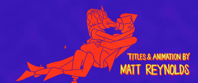
Still from the Villains sequence showing the credit for Titles & Animation by Matt Reynolds

