Do you remember the best concert you ever went to? You know, the one where your favourite band brought down the house and you partied harder than you ever have before or since? If you’ve ever had an experience like that then you will most certainly recognize the vein being tapped into by the raw and rollicking opening to HBO’s Vinyl.
A new music drama from the venerable cable channel, Vinyl centers on record executive Richie Finestra (Bobby Cannavale), a ticking time bomb of a man subsisting on a steady diet of booze, cocaine, and rage, desperately trying to save his label by signing the next big thing. Co-created by the dream team of Mick Jagger, Martin Scorsese, Rich Cohen, and Terence Winter, the series shines light on one of the most exciting and insane eras in music history: the early 1970s in New York City. It was a time ruled by rock stars and record men, a place where proto-punk and primordial hip hop were birthed within earshot of psychedelic soul and stadium glam rock.
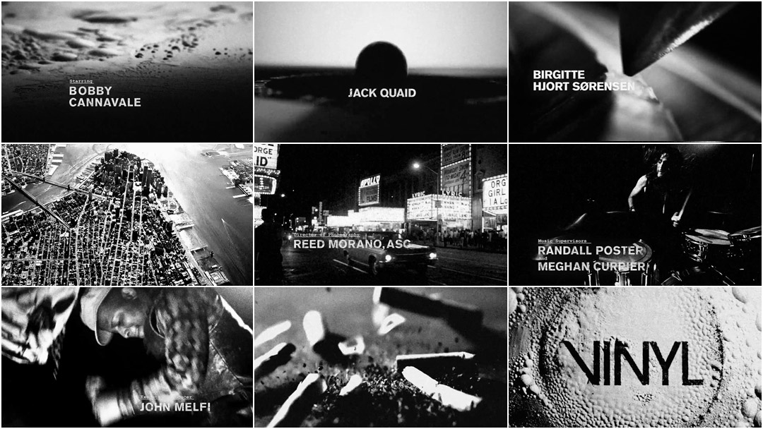
To create Vinyl’s opening title sequence, the producers enlisted studio Imaginary Forces to channel Richie’s depraved essence and capture the zeitgeist of ‘70s NYC. A team working in both New York and Los Angeles brought together numerous concepts – including high-speed and macro photography – to create a minute and a half of blisteringly intense, hard rockin’ title design. From the moment the stylus needle first tears into the LP’s groove to rocker Sturgill Simpson’s final venue-demolishing scream, the Vinyl sequence is turned up to eleven throughout, still reverberating in your chest as the show begins. Forget the encore, give us that opening act again.
A discussion with Creative Directors ALAN WILLIAMS and MICHELLE DOUGHERTY and Editor JESSICA LEDOUX of Imaginary Forces.
Alan and Jess – Can you give us a little background on yourselves and the New York office of Imaginary Forces?
Alan: I am an English major who made a career shift from literary to visual storytelling at 28, earning a MFA at Savannah College of Art and Design. Upon graduating I took a job with Imaginary Forces as a designer where I’ve worked for the last five years and now serve as a creative director. I work with the most inspiring, kindhearted people. It’s an absolute honour to have the opportunity to create beautiful things with each of them. I live with my wife, Kerri, in Brooklyn where you’ll find us gardening in our backyard or daydreaming of writing the next best children’s book in some coffee shop.
Jess: I graduated from the film studies program at UNC Wilmington. I was an editor for many years at The Mill NY office and then Imaginary Forces scooped me up about a year ago. The Vinyl titles ended up being my first big project with IF, which was a super exciting piece to start with. They have a very “all hands on deck” mentality at IF and Vinyl was a great example of how fruitful that approach can be in a pitch process. It was thrilling to come up with the concept for such a rock ‘n’ roll project.
So the Vinyl opening involved members of Imaginary Forces on both coasts – New York and Los Angeles. This was a big project! Could you tell us about some of the original concepts for the pitch and how they were developed?
Alan: IF definitely wanted to win this. Almost all of our creatives were involved in the pitch which brought a large number of concepts to the table. Our main goal was to visualize the 1970s NYC music scene in a fresh and evocative way to the likes of Mick Jagger and Martin Scorsese. It was an amazing challenge. How do you create something that moves those who not only lived through that movement but were lead characters in it?
Michelle: As Alan said, we had some great concepts that many at IF put forward. One of them was a concept where we use a record to instigate the world in which the main character, Richie lives in. That concept, funny enough was called “RECORD”. Not very original, is it? But the visuals and tone were.
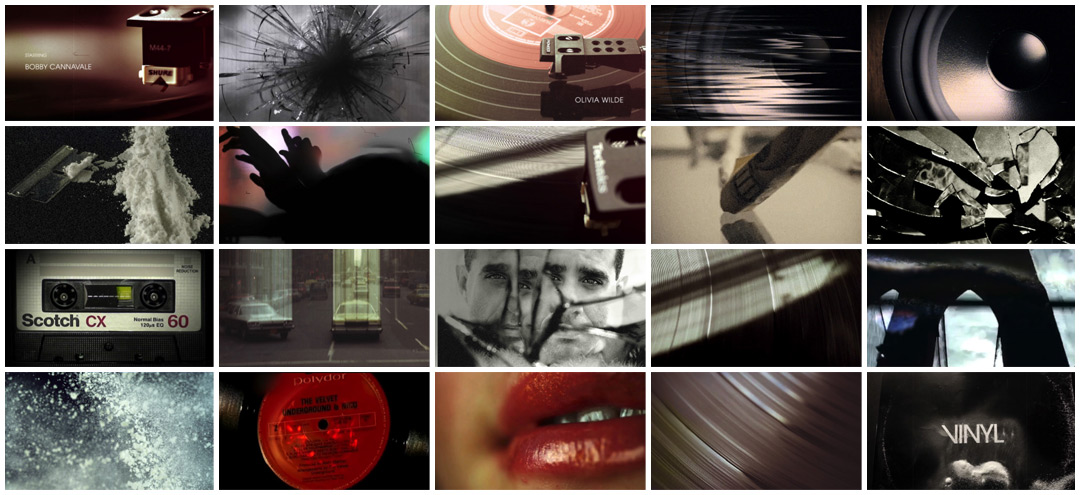
Image set: "RECORD" concept exploration
Michelle: The moment the record is played we dive into Richie’s thoughts which gives us a rush and gets our hearts pounding and ready to experience this unique world. Within that journey we also see a glimpse into the world this man breathes in which include sex, drugs, money, and New York. We wanted to create a visual feast with the exuberance characterized by the 1970s.
Another board that was presented was created by Jeremy Cox. It used the photocopied aesthetic of gig posters and other ephemera from the 1970s to create a kinetic experience that was primarily typographic.
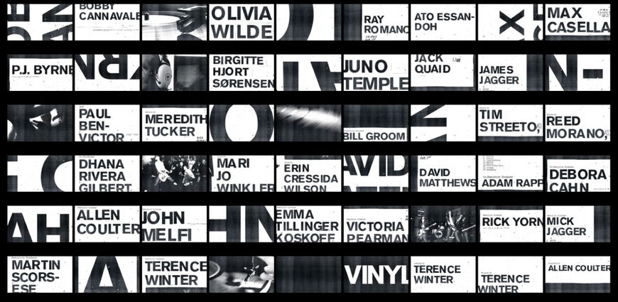
"Gig Posters" type treatment designed by Jeremy Cox
Michelle: It was bold and in-your-face and he proposed having the credits cut together quickly so they became almost blips of information. He also proposed having the record and concert footage that would be intercut in this primarily type-driven sequence. It was graphic, fresh and also had high energy.
So what were some other key ideas that set the team on the path to the final concept?
Alan: After brainstorming with Jessica, we concluded that we wanted to explore the impact of music through the visual representations of vibrations, dissonance, and even destruction. Music impacts mood, shifts ideas, ignites riots. The explosive shift in the 1970s knocked New York City – and the world – on its back. Much of the music blaring from these NYC night clubs was irreverent and out of control. We wanted these titles to feel the same.
How do you create something that moves those who not only lived through that movement but were lead characters in it?

Destruction reference imagery
Jess: Grittiness was the first thing to come to mind about the 1970s. In New York, buildings were decaying, defaced, and falling apart – and the minds of people were deteriorating along with it. They no longer trusted their president, their parents, “the man.” People were rebelling. The ‘60s was about peace and harmony and the ‘70s was about discord. There was a total shift starting to occur and it began to emerge in the music.
Alan: We loved the idea of disorienting scale shifts, bouncing back and forth between microscopic vibrations to impacts as large as those that brought the roof down on Richie Finestra in the pilot. We've all heard music but how could we see the impact of it?
Jess: Our thought was – let’s represent this rebellion abstractly. Let’s show vibrations from sound trickling out and causing total destruction and chaos. Alan and I began ping-ponging ideas back and forth: canted angles, chaotic crowd shots, ceilings caving in, mixed with vibrations from sound. We were going to create a whirlwind of a ride, like one crazy acid trip!
Were there other inspirations for the sequence? How did you get a feel for the era?

Love Goes to Buildings on Fire by Will Hermes
Jess: We wanted to stay within the scope of 1973, when the first episode takes place. That meant CBGB’s or anything that happened after the date of the last episode was out. We researched anything we could find from that era. Scorsese films, The Warriors, the BBC doc Once Upon a Time in New York; pretty much anything to capture the zeitgeist of early ‘70s New York. I began reading Love Goes to Buildings on Fire, a book centered around those five years that changed music forever, and it all happened in NYC. Conveniently, the book begins in 1973 and it catalogues so many artists and venues at the time. It was extremely informative and helpful in painting a vivid picture of place.
Michelle: I too like Jess, read Love Goes to Buildings on Fire after Peter Frankfurt recommended it. After reading it I realized what an amazing time it was for music and so I wanted all the concepts we put forward to reflect this and for the stories and tone within the concepts to feel accurate. We weren't making a documentary of this time, but I knew that people that lived in that era would be keen if anything felt false or inaccurate. Peter was too young to be a part of the early ‘70s music scene but he definitely was part of the later half and knew stories and the history of the early days that he would recount to us. He kept us honest too.
Drugs are a very big part of Vinyl and you explore that quite literally in the sequence. What was the genesis of that high speed powder footage?
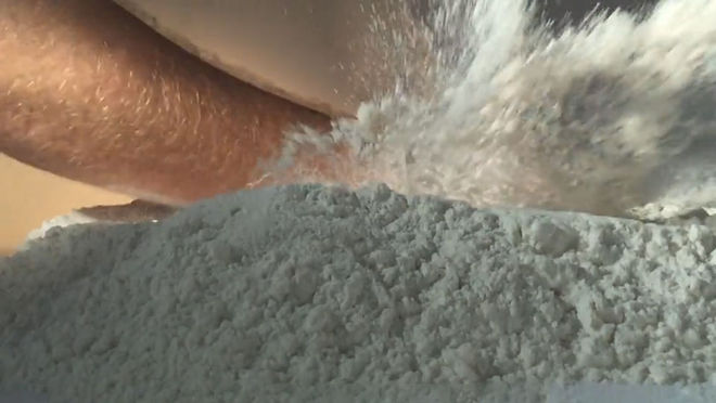
Alan: On a Sunday afternoon I was in the office trying to find a visual solution and I walked into the kitchen and found a pound of flour and brought it into our shoot space. I propped up my iPhone and shot my hand slamming down into the powder at 240 fps. As I watched the vibrations send the flour flying, I began to see a visual language for impact in an interesting way.
Initial powder test shot by Creative Director Alan Williams on his iPhone
Alan: I immediately called our EP, Jon Hassell, and said “What if we saw music? No instruments, no record player, just vibrations. I want to tarp off a portion of the office, buy 100 pounds of flour and baptize someone in a sea of vibrations.” Jon paused for a moment and replied, “I’ll give you a $100… just clean it up.” It still makes me smile.
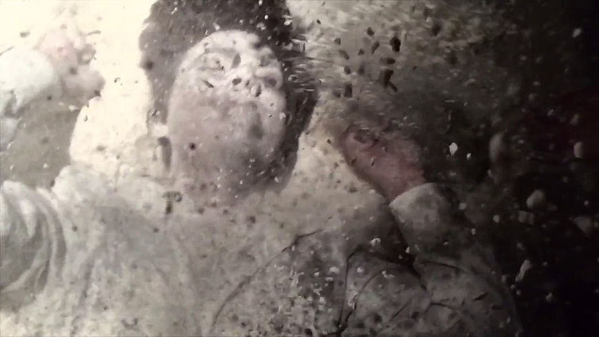
I knew that Terence Winter celebrated Nucky Thompson in the Boardwalk Empire title sequence and so I wanted to provide him the option of doing that within our vibrating powder world. I bought a $30 tarp from Home Depot, blocked off a big chunk of our office, bought 12 bags of flour from Trader Joe's, and asked my good friend and amazing editor Nate Buchik to play the role of Richie Finestra. I sat him down in a chair, blasted some Pentagram tracks and asked him to simply react to the music. No inhibition, just feel it. His foot starts tapping, his hands beating on his knees, his head nodding, until eventually he was dancing in this plastic dark space of our office. All the while we began introducing more and more flour until eventually he was completely covered. I shot it all at 240 fps with the iPhone 6S. It created interstitials for a mood edit for the pitch.
Powder footage shot for the Vinyl mood edit
Let’s talk about the macro photography in the sequence: What was the inpiration for that vibrating powder?
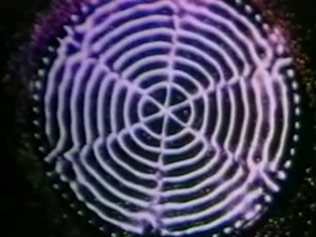
Alan: One of our biggest influences for visualizing sound waves came from a 1960s scientific video by Hans Jenny experimenting with lycopodium powder and sound vibrations. With different sound frequencies, the powder reacts, creating organic patterns of ball-like formations.
Excerpt from Cymatics (1970) by Dr. Hans Jenny
Jess: [The scientist in the video] claims that sound created everything, saying, “into the great void came sound, and matter took shape.” After you watch the lycopodium powder vibrate and create formations, it’s hard not to believe [him]!
Alan: At times it looks as if you're seeing the Grand Canyon vibrating its way into formation and others times like a circling mosh pit of bouncing powder. It’s truly hypnotic to watch.
Jess: This theory became the backbone of the piece. Everything is happening because of sound and music, it’s a driving force we can’t resist.
The final sequence is essentially an amalgam of all the concepts you’ve outlined. Why did they end up being combined?
Alan: Winter and the team loved the abstraction of “IMPACT” seeing music on various scales from microscopic to epic destruction. Winter said that he wanted the show to do for cocaine what Mad Men did for cigarettes. He really felt the drug-like speed and disorientation in our cut. There was one main concern with the team. They weren’t sure if they would have access to Bobby Cannavale for the title and if celebrating Richie was the way to go conceptually. They also liked Jeremy's photocopied type treatment. With additional help by designer and animator Henry Chang and Dan Meehan the typography was pushed further making its way into the final title. They also loved the “RECORD” concept. They wanted us to try and incorporate this, include more of NYC and really push the abstracted exploration of the powder and the needle.
Jess: Because the show was named Vinyl, Alan and I looked for ways we could get around actually showing a record in a traditional sense. I researched alternatives and I came across microscopic photos of record grooves. They looked like a topographical map!
The best titles are the ones where you discover something new every time you watch it...
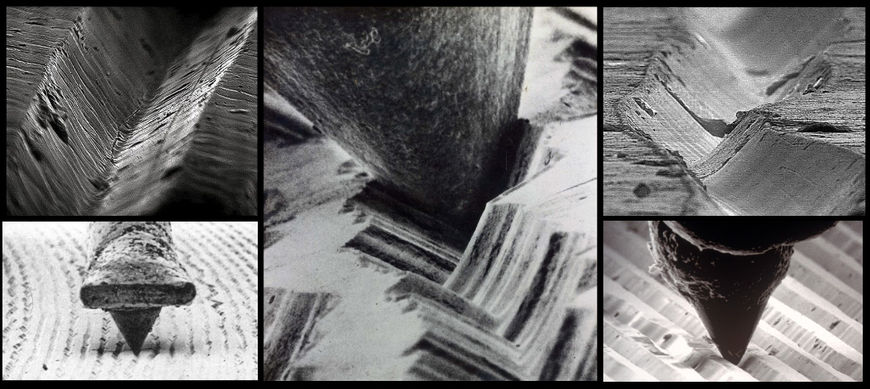
Macro turntable needle and record groove reference photos
Jess: We decided to push it further, get closer and go inside the grooves to all the action. Again, making it more abstract, so you are left wondering ”Wait, I’m inside the record?!” The best titles are the ones where you discover something new every time you watch it, tiny gems hidden in every crevice… or record groove, if you will.
Alan: I knew if we had to show the record player we were going to do it in a way that felt just like our powder: cinematic, unique, and brutally raw. Like being in the middle of an aggressive crowd during a rock show, we realized the needle when in motion bangs back and forth between the left and right channels in the vinyl's grooves. It created this very violent visual, inspiring us to create the jarring shift where the needle bounces out of the grooves, riding atop the connecting top rim, and then skipping downward into a new track. There were various explorations of showing the vinyl as an abstracted graphical element, but the showrunners felt it was this microscopic in-camera look that most represented the show. It felt unique and yet real. The violent needle alongside the vibrating powder and destruction was approved by both the showrunners and HBO giving us the green flag to push forward.
Vinyl mood exploration edit
Jess: The second pitch meeting felt like a rollercoaster of emotion. I’ll just say, I knew it was sold when I saw their faces as the tone edit finished. They were ecstatic! They said, “We will run all of this by ‘Mick’ and ‘Marty.’” In my head, I thought “Mick” and “Marty” were probably some higher-up TV execs. I was too excited to really process it. That’s when the lightbulb went off – “Mick” and “Marty” were Mick Jagger and Martin Scorsese!
So the live action footage in the sequence looks like it could have been shot in the 1970s. How did you achieve that classic grainy film look?
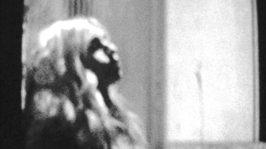
Alan: A huge challenge for us was dealing with various mediums and film stock. Our killer producer, Tess Sitzmann, was a godsend for this job managing all of these various assets throughout each stage. Some footage we used was on 8mm, 16mm, VHS, and even modern SLRs. We loved connecting the visuals of vibrating particles and low-fi photocopied flyers to the grain and degradation of Super 8 film. What distortion pedals did to electric guitars, we wanted to do with our film stock. And so we settled on a look of raw, grainy, black and white film. We shot test early on with a Super 8 camera that really sold this look to HBO.
Super 8 test footage featuring Editor Jessica Ledoux
Music is central to the series and to the opening titles as well. What were some of the initial ideas for the theme song?
Jess: We only went through three songs in this process, which is pretty crazy if you consider this show is solely about music. I opted to not use music from the ‘70s because it was too familiar. It took on its own personality and became distracting, instead of contributing to the feel of the overall piece. We were looking for something that had energy, something that felt like a fist to the face! In our first tone edit, I used a song from Thee Oh Sees. It was perfect in tone, but wasn’t “the one.” Then I made a huge Spotify playlist of song ideas and I decided to drop one in – "Tomboy" by the Greek band Acid Baby Jesus.
"Tomboy" by Acid Baby Jesus
Jess: That was the song that pushed this baby all the way until the last weeks of the edit. It was gritty, aggressive, fuzzy, and felt like it could be from that era. Ultimately, they decided upon a song that was created exclusively for the title, which totally made sense.
Which tools and software did you use to put it all together?
Alan: For all our CG work we relied heavily on Maxon’s Cinema 4D R17. Displacement, global illumination, and depth of field were impressively fast when rendered through C4D's Physical Render engine which allowed us to create tonnes of material for Jessica to cut to. Bhakti Patel really led this project in the CG department creating the majority of the needle shots. I couldn’t recommend her enough! Along with the needle shots, she dominated the task of creating the NYC subways in the 1970s, and along with the help of the brilliant Dan Meehan and Sekani Solomon destruction shots of walls crumbling and dust flying.

Image set: CG subway process stills
Was there anything that took you by surprise when working on this sequence?
Alan: This being my first experience with HBO I had no idea what to expect. The most wonderful surprise was just how trusting and open the team was to wild ideas. Never once did we feel our creativity was stifled but instead celebrated and encouraged. When they did have feedback, it was superb. Vinyl was one of those dream jobs where you connect with the creative team and are able to build something really great.
Jess: There is nothing more nerve wracking than getting edit notes directly from Martin Scorsese, Terence Winter, and Mick Jagger! It turned out there was nothing to be worried about. It seemed like everyone was on the same page about what we wanted this to be.
What element(s) of this sequence are you most happy with?
Alan: I am most happy with how frenetic and raw our edit feels. When working with a company like HBO there is this hesitation in creating an anti-prestigious title sequence. From the very beginning I wanted the viewer to feel adrenaline racing, disorienting dissonance, like what the crowds during The Stooges might have felt. I wanted the viewer to feel the raw guttural reaction that Richie Finestra felt when the club caved in on him. I wanted young and old to be reminded of that first rock show that blew their minds and just how indebted we are to those in the ‘70s that paved the way for it.
Jess: Total grit! Total chaos! I loved that we were able to take degraded Super 8 and VHS footage and degrade it even further. There aren’t many projects that come along that allow you to just rip it apart and create an experience of total chaos. Only in the ‘70s!
There aren’t many projects that come along that allow you to just rip it apart and create an experience of total chaos.
Vinyl (2016) promo
Michelle: I love all of it. I think it turned out so beautifully. Alan and Jessica did an amazing job. They and the entire team put their heart and soul in the work. All the designers that pitched: Zach Kilroy's beautiful initial edits, Jeremy Cox's beautiful type, Bhakti Patel's needle, Dan Meehan's crumbling wall, Peter Frankfurt's direction, Jon Hassell's talents and humour, Tess Sitzmann’s producing and coordination with our LA office along with Dunja Vitoli. Chip Houghton's enthusiasm and relentlessness that got us in the door. You can feel all of this love in the final piece.
Jessica and Alan made an amazing creative team. Jess is hungry, super talented, smart – all those things made her edit full of passion. You can feel it. And Alan is so amazing. He is so talented and has this amazing sense of design and direction. His designs are empathetic. Most importantly he is one of the kindest people I know.
What are some of your personal favourite title sequences, whether classic or contemporary?
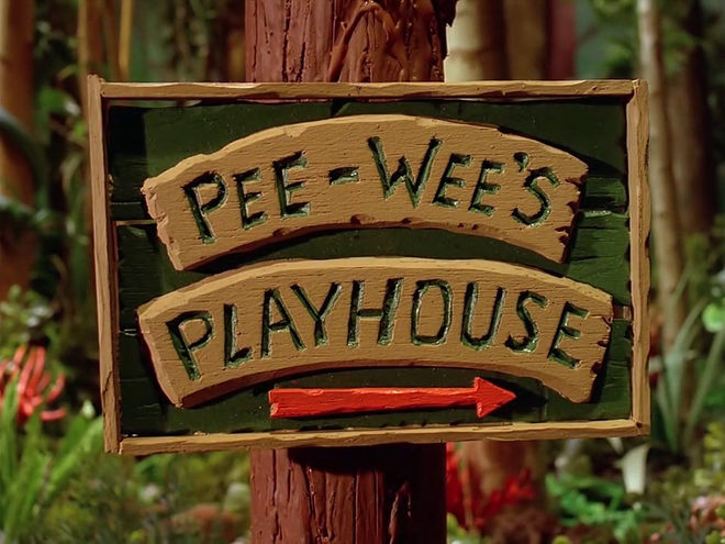
Alan: One of my most influential titles as a kid was the stop motion beginning portion of Pee-wee’s Playhouse. I loved the whimsical push through the woods and the movement of the camera encircling his eclectic house. As a wide-eyed kid it did exactly what every good title should do, it prepared me for the show.
Pee-wee's Playhouse (1986) season one title sequence
Alan: I adore Stephen Frankfurt’s 1960’s title sequence To Kill A Mockingbird. Almost 60 years after its creation, with clever compositions and striking sound design, the titles take me out of my world and into the heart and mind of Scout. They are timeless.
Jess: I’ve always thought the Dexter titles were so creative. The brilliant connections between murder and everyday objects was inspirational to me as an editor. Then there are the unforgettable Sopranos titles. The simplicity is perfection. As many times as I have binged seasons of that show, I have never once skipped through those titles. And, of course, I can’t forget, the dark and gritty True Blood titles. So raw and carnal! That might have been when I fell in love with titles.
What have you seen or watched lately that’s been exciting to you?
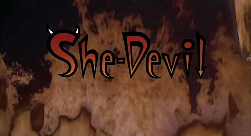
Jess: I recently watched She-Devil, with Roseanne Barr and Meryl Streep and I have fallen in love with the costumes and set design. So amazingly quirky!
She-Devil (1989) title sequence, designed by Kyle Cooper, Bruce Schluter, and Russell Calabrese
Jess: I’m always a sucker for worldmaking. Like Raising Arizona, Beetlejuice, Naked Lunch, Tim Burton’s Batman. All the colours and props precisely chosen to create a dark and eerie version of the world we know. Take me there!
Alan: I just saw the movie Room. I was intrigued by how the author and director cleverly used such a strange framework to make a coming of age story fresh and evocative. I remember being crushed by the film and not realizing until hours of introspection later why. Any time an artist can repackage life, everything from a bad breakup to the colours in a sunset, and make me feel and see it with fresh eyes that is a success. Room did just that.

