The heart of every revolution is a human one, the signs written by hand. In We Are The Giant, director Greg Barker delivers a devastating account of the Arab Spring, intimately focused on the stories of fathers, mothers, sons, daughters – revolutionaries – across Libya, Syria, and Bahrain with an eye to the world.
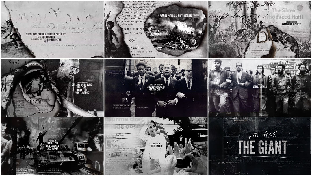
The title sequence to the documentary, designed by Manija Emran at The Mill, breathes fire into black and white photography, weaving parallels between disparate images of the human spirit in revolt. The sequence sets up a graphic language that acts as backbone for the film, a grounding element between chapters, that burns through the strata of time and place and insists upon uprising as universal language. No revolution is an island.
A discussion with Creative Director MANIJA EMRAN of The Mill.
Give us a little background on yourself.
I am an Afghan graphic designer, born in Kabul, raised in Essen, Germany and later Montreal, Canada. I studied and worked in Montreal before working with many different people in London, Paris, and New York. Then, I went to LA where I moved into motion and title design working with Prologue and The Mill.
And so you’re with The Mill now, in Los Angeles. How did this project come to you?
The project came about when Director Greg Barker approached me at The Mill to create the graphics and the visual look of his latest documentary We Are The Giant. We had an existing working relationship, as last year I designed the titles and graphics for his documentary Manhunt: The Search for Bin Laden.
Manhunt: The Search for Bin Laden (2013) main titles
And so when he asked me if I was interested in designing the graphics for his next documentary, of course we jumped at the opportunity. I'm a fan of his work and he is absolutely lovely to work with. Stephen Venning, who is executive director at The Mill, saw the potential in this project and with Ben Hampshire, managing director, they took this project on.
The brief was similar to Manhunt's: help tell the narrative and bring to life the core subject of the film – look at the film and react to it.
What did you do next? How did you proceed?
I went away and watched the film, which was in a rough version at the time. It is a film that touches upon personal stories from three countries of the Arab Spring movement and links them to historic events and iconic figures throughout history. It explores the sacrifices and decisions individuals make for what they believe is their right. My initial reaction was to try to encompass “revolution.”
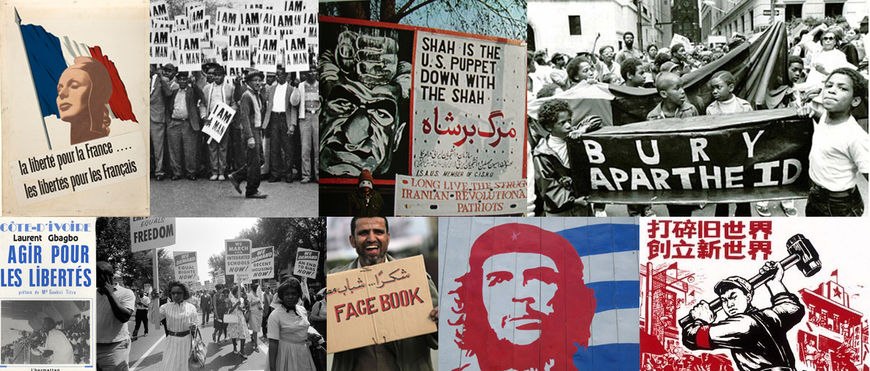
Revolution graphics references from around the world
So I set about doing research on the subject itself. Rather than books and other work, I looked at the revolutions themselves. I looked at different ways people made themselves heard and seen. I looked at how some of these messages were brought to life. And I found recurring themes in the research: all were based on the human touch. It is born from the human hand. Everything from the actual posters and slogans used in revolutions and the well known words such as the "bury apartheid" slogan and the "I am a man" sign to the iconic raised fist as a symbol of resistance and the Che Guevara posters.
Revolutions are born of people. A collection of individuals coming together who express themselves via different media: the written word, handmade signs, painted graffiti, Twitter feeds, printed pamphlets, burned flags, burned images, etc. I wanted to combine all of these looks and mediums into one cohesive language.
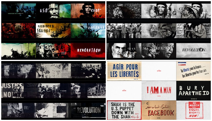
“Spreading of the Word”, “Burn”, “Revolution reproduced”, and “The Power of Signs” pitch explorations
I decided to tell the narratives by building them through different means of expression: using layers of different mediums reflecting individuals, which when combined, created one picture, one voice. In this way, the design is an extension of the film. I started with the base visual of the burn, which was to me the most powerful single image representing revolutions, and I built upon it.
Were there specific pieces of footage or newsreels that inspired you?
Robert Capa was a Hungarian war photographer and photojournalist who covered five wars. He also co-founded Magnum Photos which was the first cooperative agency for worldwide freelance photographers.
Yes, when you see the photography of Robert Capa and the other Magnum photographers the impact of the verité style – of being there as part of the action – felt so important. This influenced the graphical style, the transitions, and the approach. The propaganda graphics of different eras of course also influenced the look. Again, it’s the importance of research coming into play.
Can you tell us more about that burn effect? How was that achieved?
We took a day to do a mini-shoot, with a RED Epic, some plates of the burning and ink moments to have some original transitions. We filmed burns in front of green screen for the animators to eventually incorporate into the animations. I used textures, paint, type, ink, newspaper headlines, photocopies, etc. I thought it was important to stick to a monochromatic language which would evoke newspapers and old photographs.
Raw video of the burning effect over green screen
Because of the tight turnaround and the sheer amount of work, as with Manhunt, I knew that the process needed to be extremely streamlined! There was not much time for exploration. And so I designed each keyframe of the sequences, including transition examples. I used Photoshop to design all the frames – more than 200 keyframes! Once they were approved, I handed them over to the animators whose work I creative directed. They used After Effects for the animation.
And the music? When did that come in?
The editor, Joshua Altman, held that part of the picture. The track, "Stormur" by Sigur Rós, came in pretty early and it allowed us to – unlike a lot of title sequences – bring the sequence to life quickly early on.
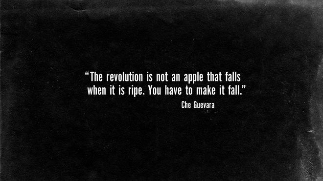
Opening Che Guevara quote
Was the Che Guevara quote always how the sequence and film started?
No, initially it started with graphics, but it felt a little overpowering. I thought a quote would bring the audience into the subject with more impact. It also ties the title very well to all the other graphic sequences within the film, as they all start with quotes, too. The footage in documentaries at times varies greatly – unlike features, which have a unified look – so a strong, visually cohesive graphic language is needed so that the various footage sources won’t appear disconnected. Besides the overall graphic look, the quotes helped achieve this and added a visual constant within the film – an additional unifying element.
Given the lettering and signage in many of the images, how difficult was it to also work in all of the credits?
This was very difficult to tackle. Finding a balance of the powerful graphics – the paint, digital feeds, newspaper headlines, printed posters, revolutionary photos – with the film’s credits was tricky. They needed to draw attention to themselves while simultaneously looking like part of the whole – not disconnected. We went back and forth with placement to avoid crowding the frames. Eventually I styled the frames using as much negative space as possible to pull the cards forwards.

Opening titles credit frames
Is designing the title sequence and graphics for a documentary different from designing for other types of projects?
For me, it’s about the power of the subject matter. You cannot cut corners with research and development as the truth of the film needs to come first. Any flourish or embellishment of fact diminishes the film. With both We Are The Giant and Manhunt, research was paramount and all-encompassing.
Also, in documentaries the edit continuously changes until the very end! This directly impacts the graphics, often turning the project into a moving target. So one must be more flexible with documentaries.
'Ordinary People' historical sequence from the film
Who did you work with on this title sequence and how big was the production team?
For the title sequence itself I worked with a very small team. The Mill's team consisted of three animators – Justin Sucara, Victor Duncan, and Greg Park – who did a brilliant job of bringing the designs, textures, and concept to life, two producers, and myself as the sole designer and director. I also worked with the film's editor, Josh Altman, who was a fundamental shorthand. We were all eager to make the best of this project as we knew what a great film this is. Everyone gave it their best and we made an extremely demanding delivery of 13:22 minutes of full-on design and animation in roughly 4 weeks. With a project like this, it's a true labor of love with all involved!
We Are The Giant “Traveling through Revolutions” end title sequence
What surprised you most during this process?
Seeing how I lived and breathed this project, it was important to me to see the final film on the big screen. And so I flew out to Salt Lake City for its premiere at Sundance on January 20th, 2013. The film and its graphics were very well received and after the film lots of people came up to compliment us on the graphics and how they elevated the film.
What are some of your personal favorite title sequences, either classic or contemporary?
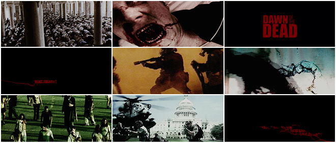
There are quite a few, but the title sequence that drew me to make the jump from print design to motion was Dawn of the Dead.
Dawn of the Dead (2004) main titles designed by Kyle Cooper and Prologue Films
I remember seeing that sequence and being completely fascinated by it, the sheer impact of it. It was as if at that moment I had discovered what I wanted to do next and so I looked up the person and the company that created that piece and applied to work there. And so, I have a soft spot for that sequence.
Did working on this project have any personal significance for you?
Unlike Manhunt where I had a connection through Afghanistan, I had no direct personal connection. But on an indirect note, whilst working on the doc, my thoughts often seemed to wander to my parents, their courage, and their sacrifices: taking great risk fleeing their homeland due to the Russian invasion so their kids wouldn’t have to live under a constant state of fear. So in that sense, I may have a built-in sense or fear of oppression…
But the power of the Arab Spring movement and the women who were pushing that really inspired me.

