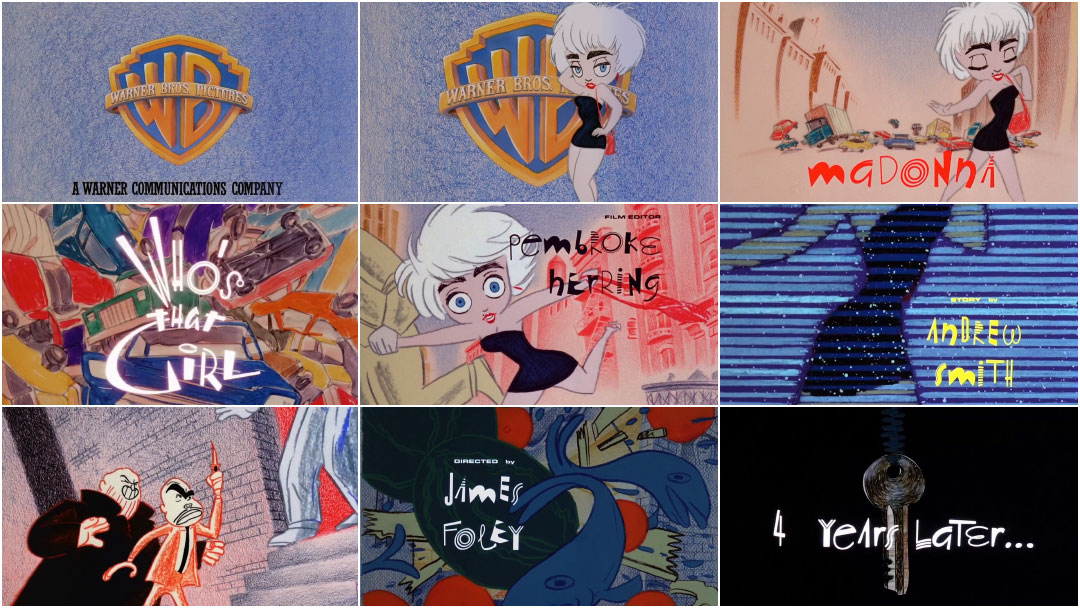
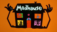
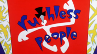
Who's That Girl may not be the most memorable movie of Madonna's career, but its main titles are unforgettable.
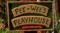
The animated (in both senses of the term) intro directed by Ric Machin of Broadcast Arts (of Pee-wee’s Playhouse fame) offers not only a preamble to the narrative, but a lesson in how to make your main titles pop – even further than the film, in this case. Even filmmaker James Foley concedes that they are "maybe the best 'scene' in the movie" about a bleached blond manic pixie ex-con with a penchant for tutus (this is Madge circa 1987, remember) who joins forces with a lawyer (An American Werewolf in London’s Griffin Dunne) to prove her innocence. Co-written by Canadian Newsroom creator Ken Finkleman, of all people, this screwball comedy is only really noteworthy as a time capsule of the Queen of Pop's True Blue years. But the credits? Those are a thing of art.
The entire opening sequence, set to Madonna's catchy ’80s groove “Causing a Commotion,” animates the events leading up to Nikki Finn's arrest, a swinging key at the end dissolving into the one in her jail cell. The freneticism and overall anarchy of the main character is captured by the equally chaotic artwork in which the colours don't always fill in (if they are coloured at all) and the seams make the odd appearance. While the bobble-headed vixen at the center is clearly formed, everything around her seems to fall apart, much like it does in the film. Sketched in grease pencil, per cameraman Glen Claybrook, "This gave it a vibrant, sketchy feel, sort of like old xerography animation." Director James Foley came up with the idea for an animated intro, Madonna wrote the song for it, and late Argentinian artist Daniel Melgarejo conceived the bobble-headed commotion-causing babe. "He did some sketches and just thought he caught the energy of Nikki Finn," Foley says. "Love how his angular style matched the sonics of the song."
A discussion with Who’s That Girl Animation Director RIC MACHIN.
You had only made a short film before Who's That Girl. How did you end up working on this live-action feature?
In 1986 in London [UK], the company I was working with at the time, Speedy Cartoons, were producing storyboards and layouts for a New York Company, Broadcast Arts Inc., mainly 2D animation. But then with the success of Peter Gabriel's "Sledgehammer" video and the rise of MTV, mixed media productions enjoyed a renaissance. Speedy Cartoons began pre-production on a cereal commercial for Cocoa Puffs, featuring Popeye with real modelled backgrounds and 2D characters interacting.
Cocoa Puffs commercial featuring Popeye (1987) by Speedy Cartoons
It was supposed to be a six-week stay in Manhattan, but when the Cocoa Puffs project ended, the management at Broadcast Arts invited me to stay on to continue directing their other mixed media projects – Super Golden Crisp, Dinersaurs, Pop Secret popcorn, etc., as well as some MTV idents. When the Madonna title sequence was awarded in 1987, I was there to accept the challenge of directing the production.
What was your specific job on the project?
My specific job was Animation Director. The soundtrack had already been selected by Warner Brothers – Madonna’s "Causing a Commotion" – and an Argentinian artist, Daniel Melgarejo, had been drafted in to help with concept sketches and the general style of the piece. After a week or so, I had a catchy song and a pile of unconnected drawings and the brief to turn it into a three-minute animated sequence.
Working with Daniel, we began to refine and simplify the characters and backgrounds and prepare them for animation.


Likenesses of Ric Machin (center, with newspaper), Daniel Melgarejo, and Neil Masterson (right, with mouse shirt) can be seen in these stills from the title sequence
I created a narrative storyboard with the theme of Madonna being chased through Manhattan by the bad guys and being framed. From this, an animatic was shot to the track with held frames used as place-markers for the animated sequences to come. From there, freelance talent was assembled from the studio to animate the short sequences between titles, prepare background art, and work with me on scene transitions, sound effects, and editing.


How much direction did you get?
Apart from seeing the rough cut of the film, which they approved, and a fleeting visit to the twelfth floor of the Broadway studio, Madonna and James Foley left the entire project in my hands.


Were you simply asked to illustrate the backstory or was it specified, for instance, that Madonna should come out of the WB logo?
The logo at the start and the swinging key at the end were the only two immovable frames I had to work with. The general idea of how Madonna's character ended up in jail at the start of the film had to be told, but I had completely free rein to create a story between those two points.


Stills from the title sequence featuring cartoon Nikki Finn emerging from the WB logo
How did you work with the music?
I usually find it easier to work to a music track as there is a natural beat to work to and to calculate the cut points. There was a finite amount of credits to fit in, with a legal amount of three seconds held on screen per name. It was easy then to calculate and create the animated "bridges" between these points.

What were your influences?
I was heavily influenced by the work of Paul Vester at Speedy Cartoons. Of all the London Animation Companies, his had a unique, slick and stylish and instantly recognizable style.
I was heavily influenced by the work of Paul Vester at Speedy Cartoons.
Sunbeam (1980), a short film directed by Paul Vester at Speedy Cartoons
Also Oscar Grillo and Annabel Jankel were some of my early influences.
Music video for "Accidents Will Happen" (1979) by Elvis Costello & The Attractions, directed by Annabel Jankel and Rocky Morton. In 2003, it was one of the 35 videos selected for the Museum of Modern Art's Golden Oldies of Music Video exhibition.
Do you have personal favourite title sequences?
I enjoyed National Lampoon’s Christmas Vacation titles, The Pink Panther series, The Animated Batman Series titles, Catch Me If You Can, and anything by Saul Bass.
Glen Claybrook, the cameraman, mentioned the cels were done in grease pencil, which gave the sequence a sketchy feel. How did you decide on this?
It was just a style I had grown used to in London, which gives a light, feathery, and natural look to the cels. Marker pen or ink line can be cleaner, but in this case a freer line seemed to suit the character and backgrounds. They were deliberately left open and sketchy and textured, rather than being flat enclosed fields.


On the left side of the Sir John Mills credit, the tape from the credit overlay is visible
What elements of the sequence are you most happy with?
Apart from the obvious appeal of the Madonna character, it was challenging to create interesting transitions between the three-second held frames. Vertical and horizontal wipes and cross dissolves would have been easy choices, but I wanted to make each one unique, animated, and fitting for the scenes they were attached to. The clothes flying off the rail, the TV switching off, the removal van wiping horizontally, the key in the hand, etc.


Stills from the TV shut-off scene
Turning to present day, what have you seen or watched lately that’s been exciting to you?
Not much animation I'm afraid, but I have been enthralled with Game of Thrones, Mad Men, and House of Cards.
SUPPLEMENTARY: Who's That Girl (1987) theatrical trailer


