Editor’s Note: This article has been marked “Not Safe For Work” due to elements which contain nudity and sexual situations.
In the beginning, the Internet was formless and empty. But soon there was Geocities, and Livejournal, and Fotolog – precursors of digital expression, fonts of potential.
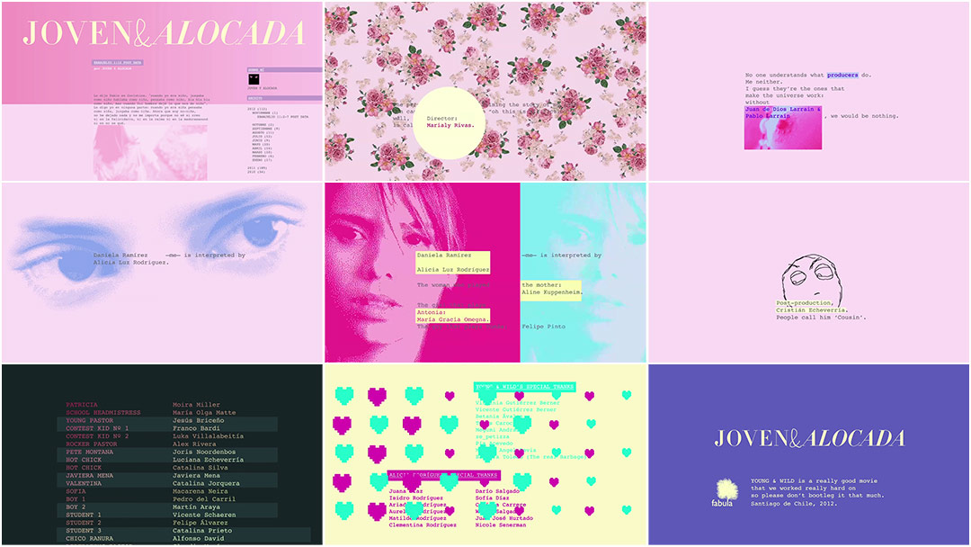
In Marialy Rivas’s 2012 film Joven y Alocada (Young and Wild), the blog acts as backbone to young Daniela’s spirited and saucy narrative. When the film ends, the frame is swathed in a soft rose and we scroll ever downward through the teasing end credits. We are gently pulled along and tempted into participating with flashes of animated sensuality: a breast here, a flaming crotch there, and all the while, this dreamy electro-pop ballad lulls us into delighted submission. So we watch, hoping for more, chunks of Courier New adorning the less rousing portions, when finally, there it is – one last, ejaculatory hurrah.
Creative Director PABLO GONZÁLEZ of Smog details the creation of their stimulating and distinctive end credits to Joven y Alocada.
How did the first meeting about this sequence go?
Pablo: Marialy, the director, called us. We had worked together before on her short film Blocks, making both the titles and the poster. The titles were a really no-frills sequence but we found that we worked fantastically well together. Also, she was like the hottest advertising director at the time, shooting several commercials a week, so we also worked on her commercials from time to time.
We met in a restaurant near my office – we work in this super-funky Chinatown-like part of the city – and Marialy took a script out of her bag and started telling me about this movie she would start shooting in a month. See, in the early 2000s, there was this website called Fotolog, that apparently didn’t take off anywhere but in Chile. It became pretty much the social network that an entire generation used to communicate – people who now are in their mid-20s. So, in those pre-Flickr days, Marialy followed this intriguing girl who was like ten years younger than her: evangelical, bisexual... Of course, she had a Fotolog account and a couple of blogs where she signed “Joven y Alocada” – Young and Wild.
In order to avoid obsolescence, deliberately use already-obsolete resources.
Pablo: Those blogs were no longer active, but they contained the DNA of her film. Marialy contacted this girl, bought the rights, and together they worked on the script of her biopic.
Although I was pretty aware of the Fotolog/blogging scene – I actually took a little part in it, although I was a little old for it – I was not aware of this “Joven y Alocada” girl. Marialy had all the entries printed, though, and they were hilarious and fascinating and above all, like nothing I had read before. At this point I was itching to grab that script! I had to get involved.
And where was the film at that point, production-wise? Had they already begun shooting?
Pablo: We got involved even before the shooting! I really liked the story. The movie had a 12 chapter structure, each chapter being a blog entry, after which the blog followers would post their comments. The script contained plenty of text, graphics, and suggestions for animated sequences, so Marialy wanted us to get involved as soon as possible. During pre-production there were a lot of decisions to be made that would affect the graphics, the main one being how to shoot the blog followers when they post their comments after each post.
So we started with tests on how the blog should look, how it works, how users/followers would interact... also looking for references to build – like, a visual DNA pool. We basically had to come up with the look and feel of the main character’s online world, the universe where this character would live. So we asked, what was she like? She’s a 17-year-old girl, growing up in this affluent, super-conservative evangelical family. And like any normal 17-year-old she is very sexually curious, but of course she can’t discuss that at home, so she communicates with her friends and followers via her blog. Needless to say, the blog and all the graphics had to look like it was picked by her.
That’s what makes them special – the fact that the main credits are in prose, as opposed to a classic two-column list of positions and names
Pablo: The next stage, stage two, involved spending endless hours in the editing room with Marialy and the editor, figuring out every problem the story would bring. For many situations we had a pretty clear idea of what we – or the director – wanted to see, but for others it was more difficult. It was amazing how much we felt that Marialy trusted our work and our ideas. Naturally, there were ideas that didn’t make it to the final cut, but some of the most outrageous – Geesus erecting a penis, for example – made it with no problem.
Thing is, during this stage we realized that in order for the story to be told properly, the blog not only had to exist but it had to act.
Right, so how did you go about creating the sequence?
Pablo: So, we had built this universe and there was absolutely no reason to step out of it. We all wanted to take it as far as it could go! We decided that the credits sequence would look like a blog entry. Apart from that, there was not really a very defined brief for it. It was clear what it shouldn’t be, though. Since the end of the movie was very open, the sequence could not be partial toward any character – not to judge or endorse anyone.
It occurred to me that if the credits are supposed to be part of the blog, then they should speak like the blog. I was pretty excited about that idea. I couldn’t think of another film that also had credits in prose. In order to see if it worked, I made a couple tests and explained the idea to Marialy.
Initial motion tests
Pablo: She loved it. She even said something about Jean Luc Godard! So the main credits would be not only in prose, but in a “Young and Wild” type of prose.
To me, that’s what makes them special – the fact that the main credits are in prose, as opposed to a classic two-column list of positions and names. We had the real “Joven y Alocada,” Camila Gutierrez, also the main scriptwriter, write the main cards.
Regardless of how enthusiastic I was about this whole “credits in prose” thing, it was necessary to draw a line where the more classic approach to credits would begin. I mean, things like the cast or the extras is information that is better displayed in a list and not a paragraph, right? Director, producers, writers, DP, art director, and line producer cards would have a text and image structure, but its format eventually became more free as the blog style was established. In that sense, seeing the text being typed and then diagrammed like on a word processor stresses the fact that we are in the blog.
I should mention: the director and producers were so into the sequence that we were asked to translate it into English for the Sundance Film Festival screening because the credits would’ve been ruined with subtitles on them.

Blog style evolution
How did you decide on the style and look of the blog?
Pablo: That came to be a rather important issue, because that would affect literally the entire look of the movie. The first cuts of the film hardly worked the way they should have – they couldn’t work before the blog sequences were actually placed on the timeline. We realized, then, that the blog, not only had to exist... the blog had to act! It had to be established as soon as possible that the point of view was from inside a blog. You are both in front of and inside a screen.
It was also important that the blog gave the feeling that it was the creation of a 17-year-old girl with no tools other than a browser, which is why the classic blog structure remains intact.
Other than the blog itself, the software interfaces were pretty much abstractions. Layouts, codes, and protocols would hint at the characters’ online activities. The movie assumes that the audience is familiar with social networks, instant messages, etc., and so it only takes a vague hint to establish what the characters are using.
As for typography, we chose from standard web fonts – keeping it very ’90s – in order to stress that “you are in the web” feeling – that first impression of the web. This eventually spread through the whole project: in order to avoid obsolescence, deliberately use already-obsolete resources. We chose Courier New as the font for the blog, but it had to be replaced by Courier, as we were planning on filling the screen with blog text and it worked much better in big sizes. Courier New, in my opinion, works fantastically in small sizes.

The image that established the color palette.
And what about the GIFs you used?
Pablo: Right, so Courier and obsolescence lead us directly to GIF files, another key element in the Young and Wild graphics which featured a limited color palette – we tried to keep it as limited as possible, and restrict it to fluorescent colors, ideally. For us, this was a technique that represented reality in an equally naïve and naughty way.
There was this image that was created during the experimentation phase that made it to the final cut: an erect penis, isolated, laid out in the middle of the frame, just like an insect pinned in an entomologist’s collection. The minute we saw this image we knew how the rest of the images would look. Thus appeared the flaming pussy, the cheese-filled dick, the red flashlight, and Geesus. Oh, and the theatrical poster had a parallel process. It featured another GIF, where we took the idea of an economy of resources even further and printed it in only one color: pantone 812C.
Penises, flaming vaginas, and baptisms
Can you talk about the music a bit? Did you have it from the beginning?
Pablo: Although music has a huge importance in this movie – just look at the endless list of songs in the credit sequence – the music was not there at the beginning of our process. The director had an idea of what she wanted and she collaborated very closely with Javiera Mena, the Chilean singer of a couple of covers for the movie, one of which – the song that Edith Piaf made superfamous, “Je ne regrette rien” – turned out to be for the main credits.
So when we actually received the track – an amazing cover, it must be said! – it reinforced the idea that we had for the transition into the title sequence, whereas the end dissolves in a long fade that eventually becomes an ambient sound. Image-wise, by the end of the song, the title sequence also becomes more uniform, until the more upbeat “El Amanecer,” also by Javiera Mena, begins. We used that first chord to change the tone a little bit. The sequence becomes more playful, more varied... more freestyle, you could say.
Smog's motion graphic designs from the finished film
What were your influences or references for this sequence?
Pablo: The imagery came straight from the web. If it was something that you might find in a tumblr, or on 4chan, or porlaputa – a blog that is immensely popular in Chile – it qualified for the sequence, so we had a huge amount of images to choose from... which lead us to the following problem: the internet is mostly about appropriating things. This meant that we often found ourselves discussing how much we were going to care about that: appropriating. We decided that we were not going to care, which is always kinda risky, but it was not that we were making money or selling dog food with other people’s work.
One of those “steals” attracted an e-mail from the owner of this amazing tumblr from which we took some images – he asked for credit, which he got, of course. Actually, I want to publicly thank him because he was so generous and cool about it, and what he does in his tumblr had an enormous influence on this project. So here it goes: Mr. Chris Bright, thank you very much.
It seems like you had a really comfortable relationship with the director, based on the things that you were able to include.
Pablo: Yeah, I really have to thank Marialy for her trust. I mean, I came up with things that made it to the final cut against all odds, like the ejaculation before the final card. That made me feel like I was really part of the project and not just some provider. It gave me a lot of satisfaction to be able to see my mind and my heart and – my hand! – in the movie.
People would walk past my office and I would be browsing through porn sites and I’d be able to claim that I was working!
Pablo: Another thing to note is the legal text at the end: “Young&Wild is a really good movie that we worked really hard on, so please don’t bootleg it that much. Santiago de Chile, 2012.” I wrote that as a placeholder, waiting for the production lawyers to send the real text, and when I asked about it, Marialy was like, “What? No. I love it. That text stays.” That’s my favourite joke in the titles.
Did you have a lot of discussion about the nudity and pornographic clips?
Pablo: Well, the nude clips had to be in the second half of the sequence, with the more upbeat song, in order for it to adopt a playful, goofy tone, rather than a pornographic or obscene one. By the end of the movie you will have seen a lot of nudity and sex, so the idea was that it should seem cool, a no-big-deal thing. Or maybe I just became completely insensitive to explicit images!
I mean, this is the kind of project where people would walk past my office and I would be browsing through porn sites and I’d be able to claim that I was working! With a straight face! And the file names... boy you should have seen those! Stuff like flamingpussy.gif, cheesydick.mov, things like that... And briefing people! That was just hilarious. We had a great time with this project.
How long did this sequence take to complete, from the first meeting to the final cut?
Pablo: It was a long process and it involved not only the credits but also two posters and all the graphics inside of the movie. All in all, it was over nine months.
Which tools and software did you use to put it all together?
Pablo: Nothing too fancy! After Effects and Photoshop.
End credit sequence, original Spanish language version
What are some of your favourite title sequences, whether classic or contemporary?
Pablo: So many! I am sorry for the cliché but Se7en absolutely blew my mind. I don’t remember the movie at all, but all I would talk about afterward was the title sequence. I guess the Se7en sequence is the reason I make movie titles now. I don’t think I liked it – it’s just that it changed my life.
Lately, though – and not surprisingly, it’s from Prologue – the titles for X‑Men: First Class, which, in my opinion, also marked a turning point for Hollywood film titles – back to a more elegant, classic, 2D approach. I mean, how obvious would it have been for a movie like that to go for all-CGI, glossy, high-end, over-the-top titles? But no, that sequence was the complete opposite of what people were expecting for a film like that, and it suits it just perfect.
It is really important to be sensitive with the project you’re getting involved with and not overdo the titles. Think for example about the titles of The Graduate, where text and image – which actually work more like a photograph than a moving image – coexist in such harmony with the music. It didn’t need a Saul Bass-style sequence.
What’s coming up for Smog in 2013 and beyond?
Pablo: Definitely more movie titles! The 2013 Sundance Film Festival will have two credit sequences designed here: Il Futuro directed by Alicia Scherson, and Crystal Fairy and the Magical Cactus and 2012 directed by Sebastián Silva, starring Michael Cera. We’re pretty much making the title sequences for the most important movies in Chile right now, such as the 2013 Oscar-nominated No, starring Gael García Bernal, so I guess the world comes next! That sounds like a movie villain line, but we would really love to design title sequences for films outside of Chile, as well.


